Defenders of the Galaxy


.svg)
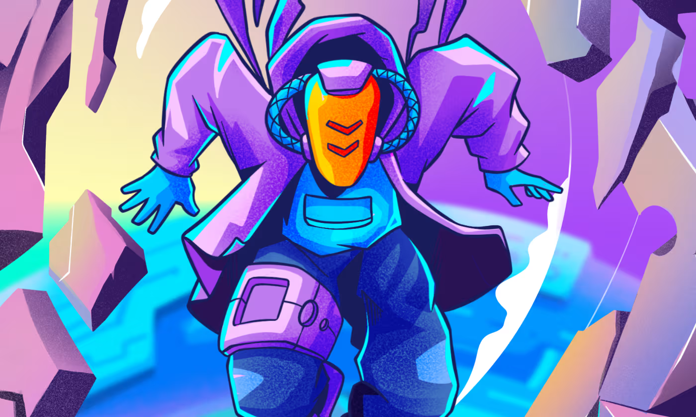
Defenders of the World is a sci-fi illustration series designed to make exploring futuristic environments and characters simple and reliable.
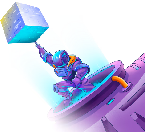
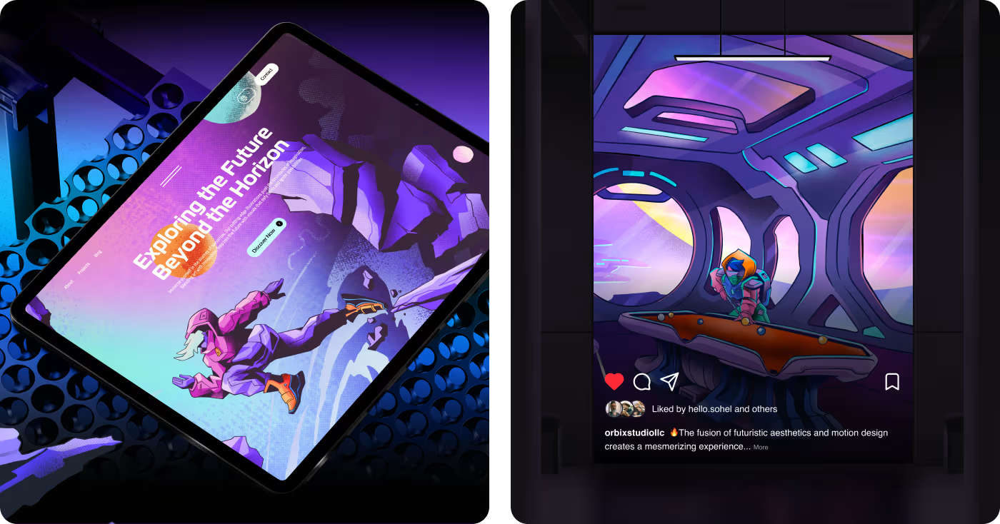
Our task was to create Defenders of the World in a way that makes the sci-fi narrative quick and easy to understand. Viewers needed a clear way to connect with the characters and track the visual flow of the scene. The artwork had to support marketing teams by helping them integrate the art into app UI mockups and social campaigns
Building a sci-fi world that felt exciting, clear, and consistent
The main challenge was creating a sci-fi visual world that looked rich and immersive without feeling messy, confusing, or disconnected across different scenes and formats.
- The artwork needed a stronger visual direction so the world felt unified instead of looking like separate pieces.
- Some scenes had the risk of becoming too busy, which could make the main subject harder to notice.
- The characters, environments, and props needed to feel like they all belonged to the same universe.
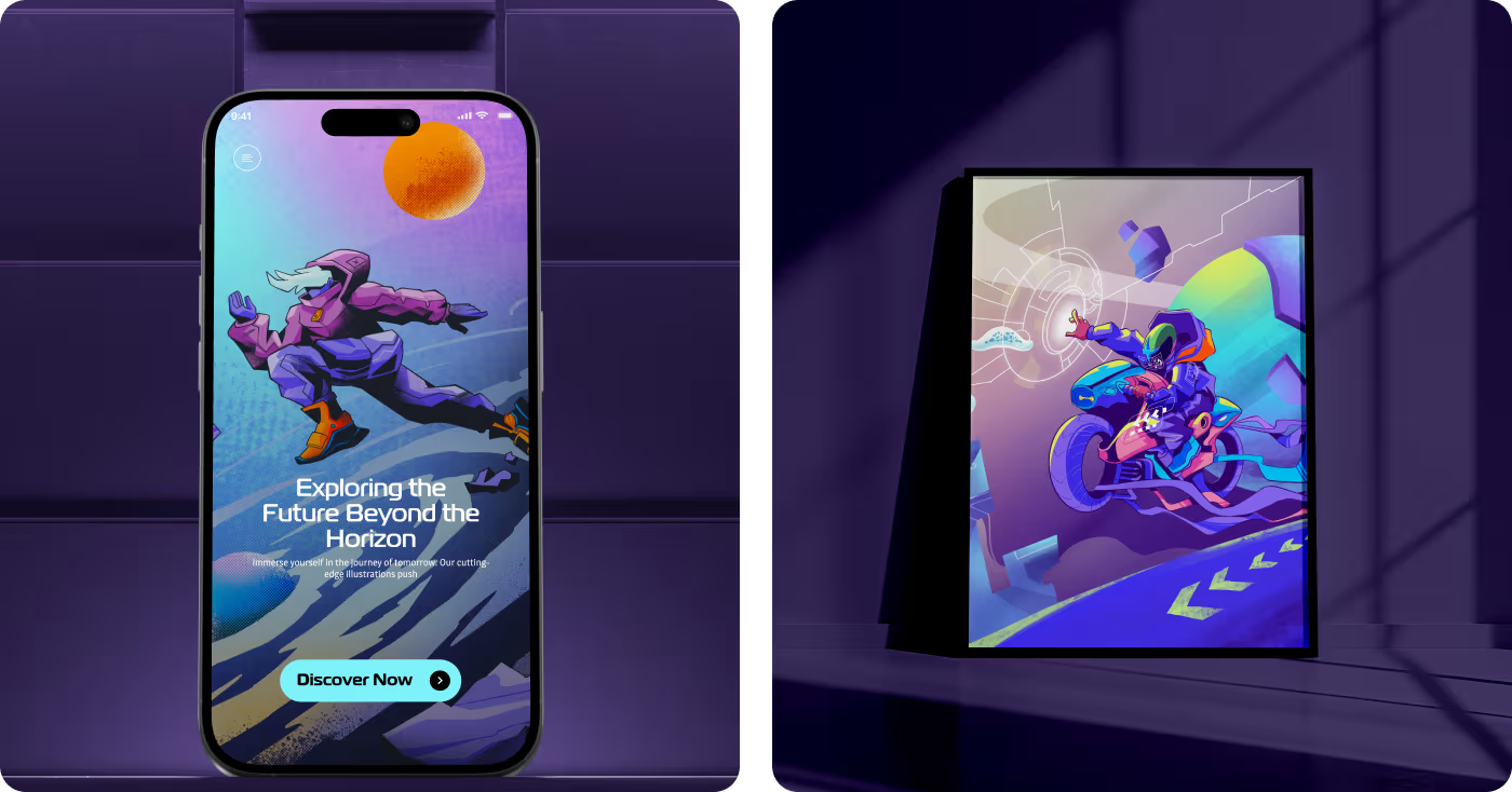
- The final visuals had to stay strong and readable across different uses like posters, screens, and social content.
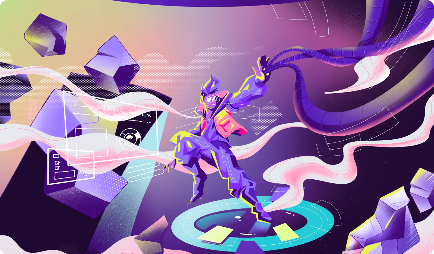
Shaping a clear and consistent sci-fi visual system
To solve this, we built a focused visual direction that made the world feel more connected, easier to read, and flexible enough to work across different scenes and brand touchpoints.
- Created a consistent art direction with a defined color palette, lighting style, and overall sci-fi mood.
- Improved visual clarity by giving each scene a stronger focal point and better separation between the subject and background.
- Designed the characters, environments, and supporting elements to feel like part of one complete world.
- Developed the artwork in a way that could adapt smoothly across posters, digital screens, social content, and branded layouts.

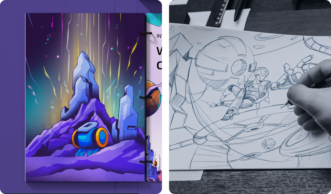
Building the visual world step by step
- Sci-fi mood exploration
- Color and lighting direction
- Visual tone setting
- Style foundation building
- Character concept development
- Environment system building
- Scene balance refinement
- Story-driven visual planning
- Stronger focal points
- Better visual contrast
- Reduced scene clutter
- Clearer visual flow
- Multi-format visual adaptation
- Layout consistency checks
- Cross-platform presentation prep
- Flexible asset application
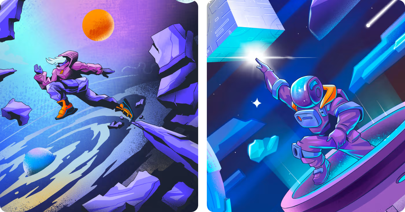
Character design environment design
The character design focused on creating figures that felt expressive, easy to recognize, and naturally connected to the larger sci-fi world. Shape, color, pose, and contrast were used to make each character stand out without breaking the overall visual style.
The work also improved scene readability. Clear silhouettes, strong styling, and balanced details helped the characters feel active, memorable, and easier to follow within more complex compositions.
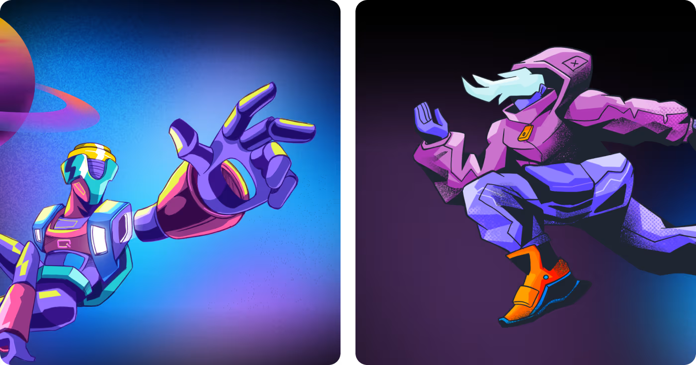
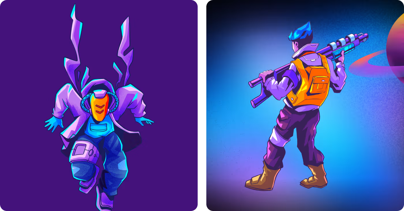
Character design environment design
The character design focused on creating figures that felt expressive, easy to recognize, and naturally connected to the larger sci-fi world. Shape, color, pose, and contrast were used to make each character stand out without breaking the overall visual style.
The work also improved scene readability. Clear silhouettes, strong styling, and balanced details helped the characters feel active, memorable, and easier to follow within more complex compositions.
Environmental design to shape the world
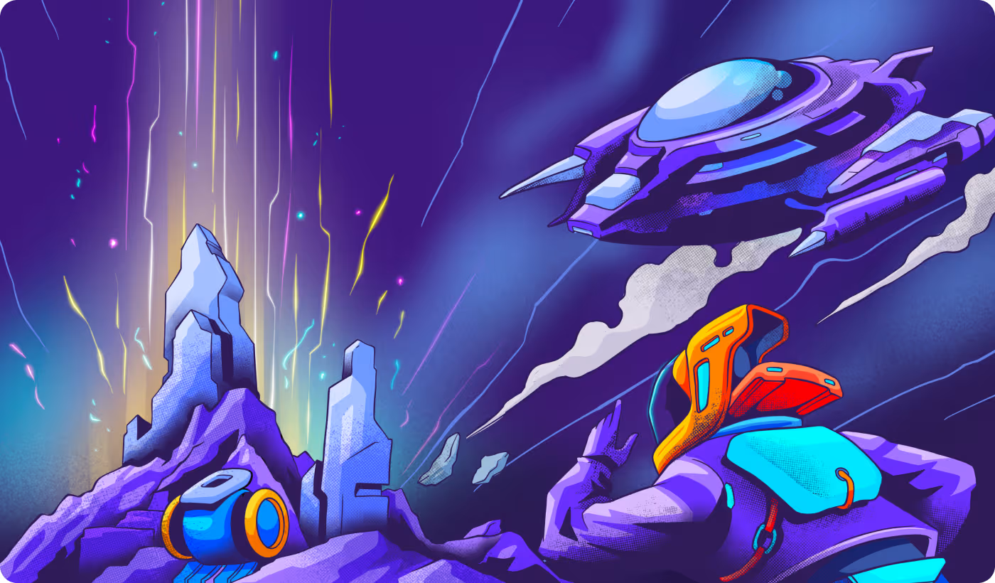
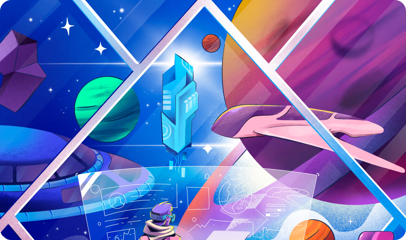
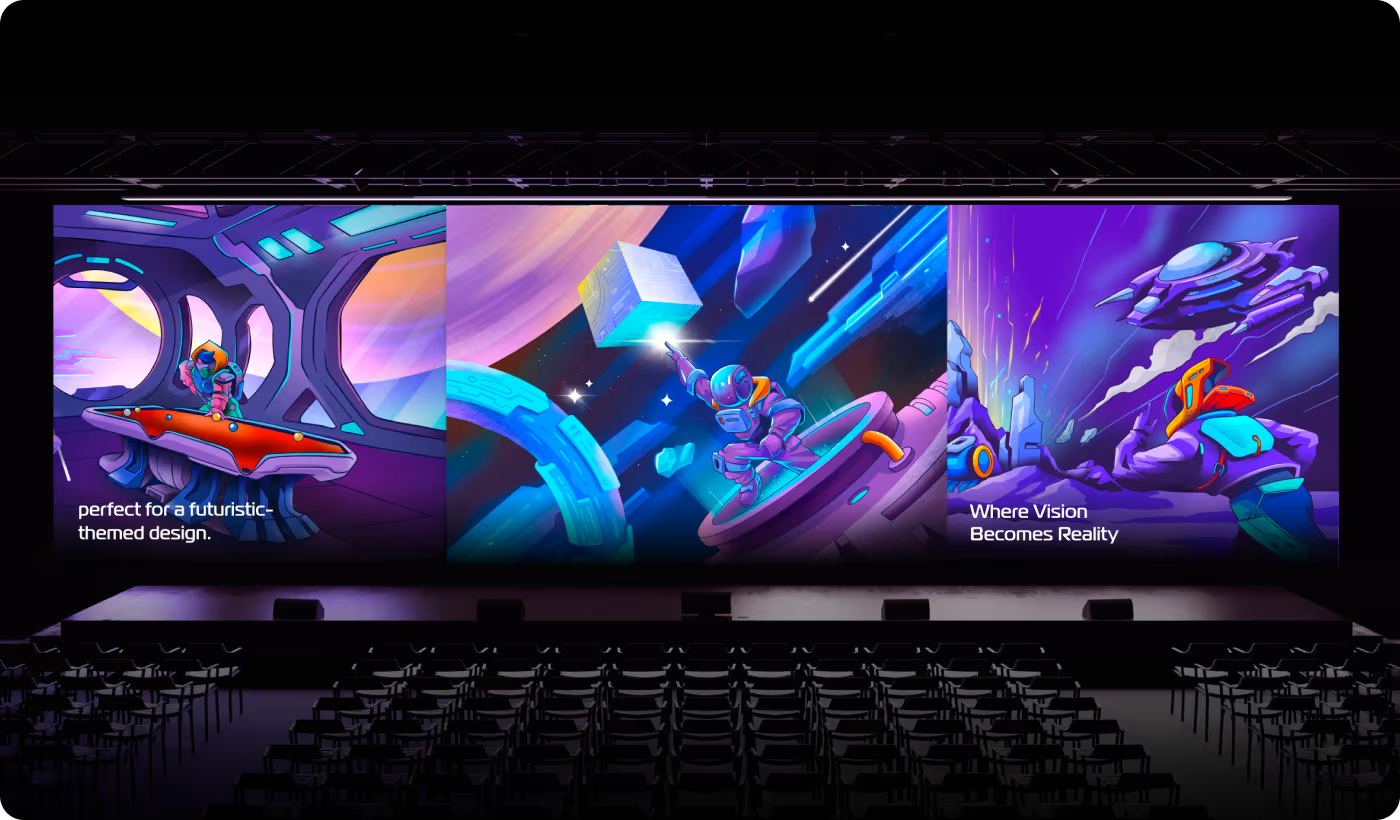
The environmental design helped build a stronger sense of place through landscapes, structures, lighting, and space-driven details that matched the same visual direction. Each setting was designed to add depth and atmosphere while supporting the larger world.
The scenes were also built to work well with the characters. Careful use of layout, scale, and visual balance helped the environments feel immersive without overpowering the main subject.
A clearer and more flexible sci-fi visual system
The final outcome was a more polished visual world that felt clearer, more connected, and easier to apply across different brand formats.
- Stronger visual consistency: Characters, environments, and colors felt more unified across the full project.
- Better scene readability: Clearer focal points and stronger contrast made the artwork easier to follow.
- More flexible brand use: The visuals worked more smoothly across screens, posters, and social content.
- Clearer worldbuilding direction: The project felt more like one complete universe instead of separate illustration pieces.
- Featured on Behance: The final work gained stronger showcase value and outside creative recognition.
Ready To Build
Your Next Project?
.avif)


%201%201.svg)




.svg)


.svg)

.svg)

.svg)
.svg)


.svg)







.avif)



.svg)

