ICC world cup India 2023
.avif)
.svg)
The ICC World Cup 2023 illustration series is a collection of vibrant artwork designed to capture the energy, cultural pride, and excitement of the global cricket tournament hosted in India.
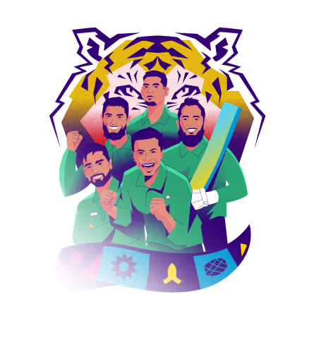
Our task was to illustrate the ICC World Cup in a way that makes the tournament feel energetic and culturally rich. Fans needed a clear way to identify their favorite teams and players through art. The visual style had to support the event's branding by balancing a cohesive cartoon aesthetic with the unique colors and symbols of ten different cricket-playing nations.
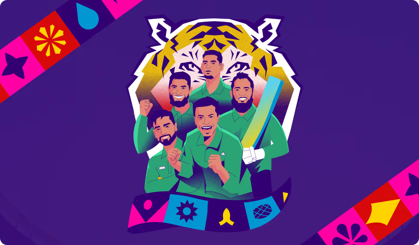
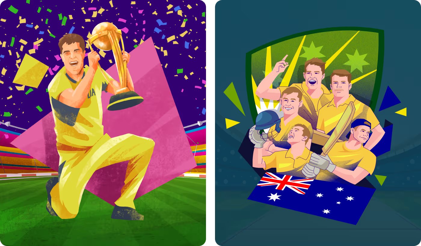
Making the tournament visuals feel clear and connected
The challenge was to create one visual system that could represent different teams, players, and match moments without feeling messy, repetitive, or hard to follow.
- Too many teams and assets could easily make the visuals feel inconsistent.
- Each team needed its own identity while still fitting into one overall style.
- Match details and rankings had to be clear without overcrowding the design.
- The visuals needed to feel exciting across posters, cards, and match graphics.
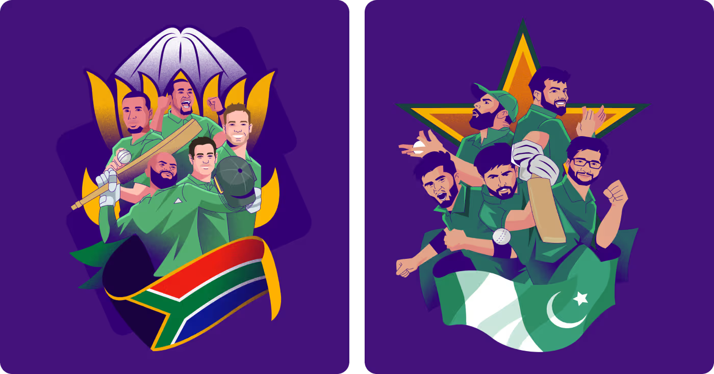

Building a flexible visual system
The solution was to create one illustration-based system that could carry team identity, match information, and tournament energy across every asset.
- Created one consistent illustration style for the full campaign.
- Used team colors, flags, and visual cues to separate each side clearly.
- Turned match details and rankings into simple, readable design elements.
- Applied the system across posters, player cards, and match graphics.
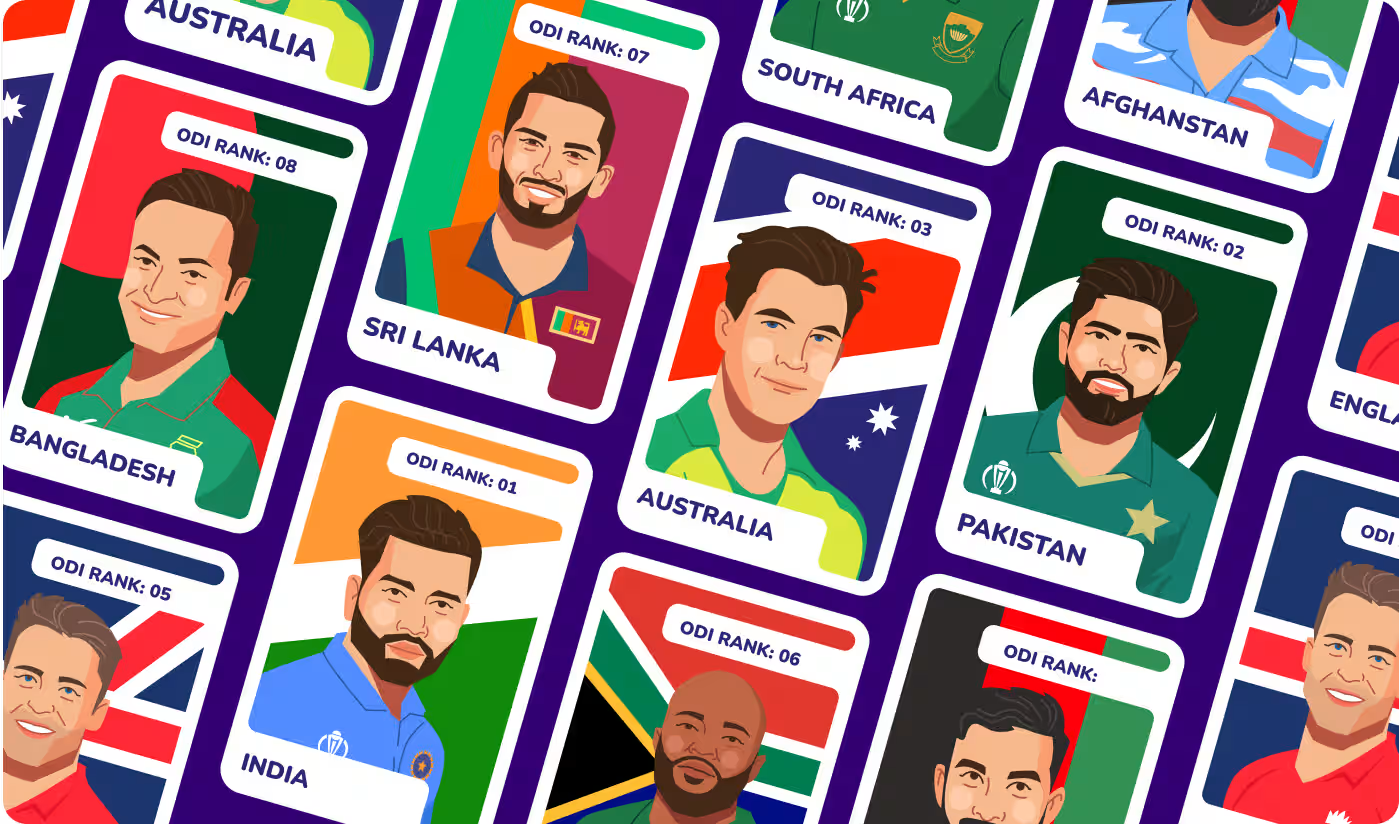
Shaping the design system
- Visual style setup
- Player illustration direction
- Color and composition
- Flexible design base
- Team color coding
- Flag-based cues
- Country-specific details
- Consistent team styling
- Ranking layout system
- Match detail placement
- Readable text balance
- Quick visual scanning
- Poster system rollout
- Player card designs
- Match graphic expansion
- Cross-format consistency
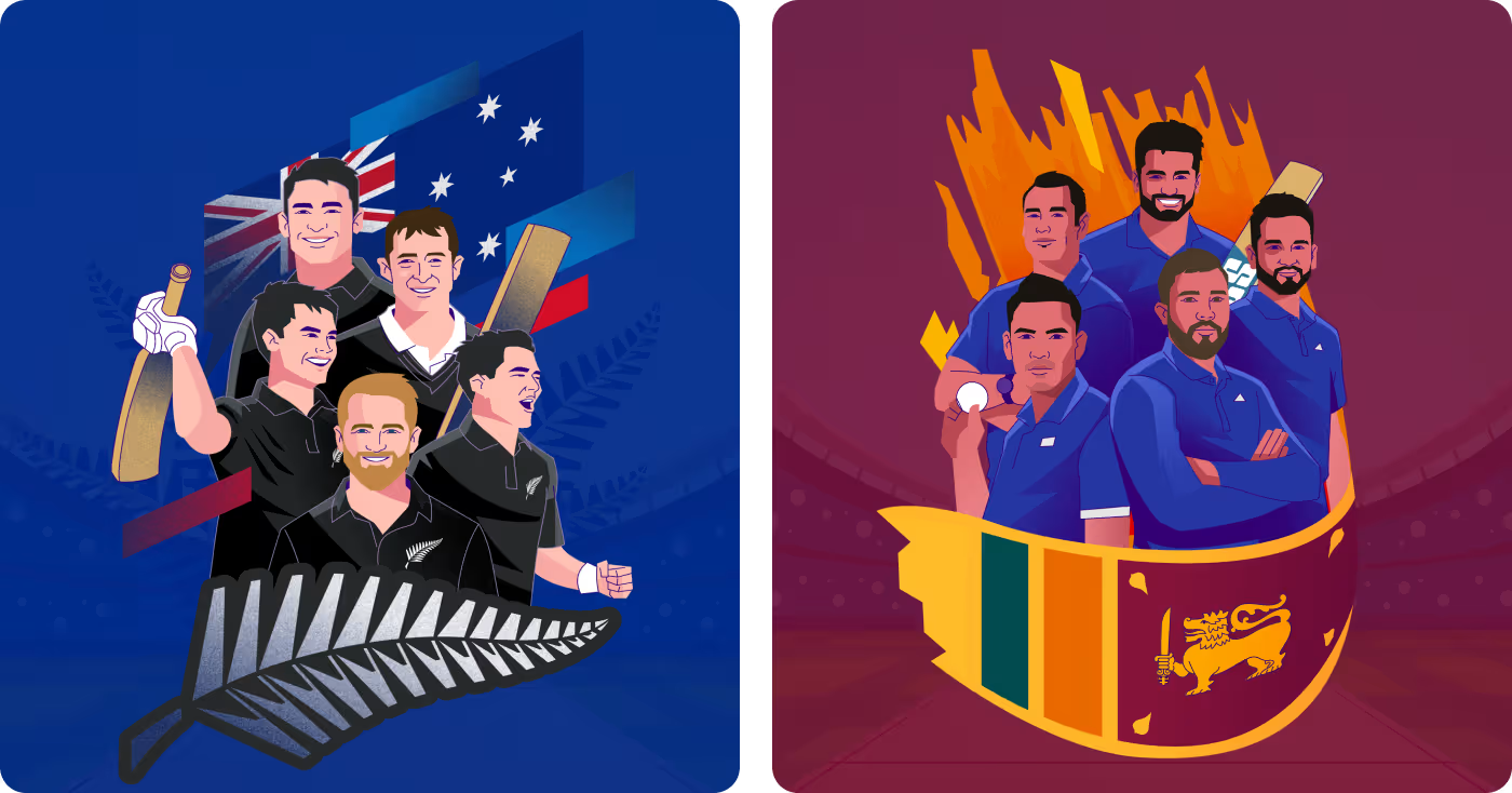

Custom Sports Illustration
The illustration work focused on building a style that could represent different teams and players in a bold and recognizable way. The goal was to make the visuals feel energetic and easy to connect with while keeping everything inside one clear system.
A lot of the work came down to how players were posed, how expressions were handled, and how each team could feel different through color and supporting details. That helped the artwork feel more specific to cricket and less like generic sports graphics.
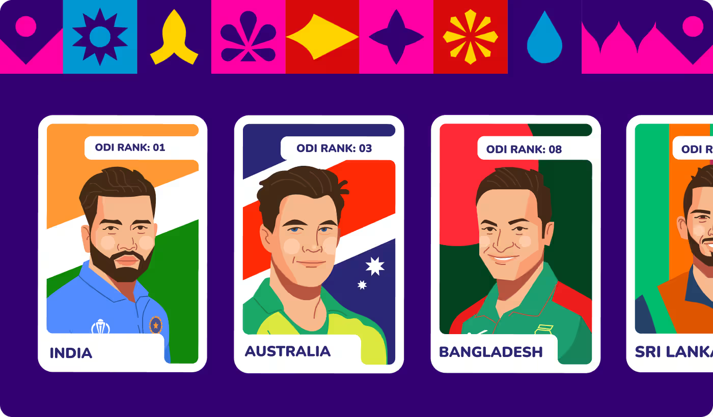
Campaign Visual System
The campaign design side was about turning the illustration style into a usable set of assets. The same visual direction needed to work across posters, player cards, match graphics, and other promotional pieces without falling apart.
That meant organizing information in a cleaner way and making sure every asset still felt connected. The result was a system that could carry the same look across different formats while staying clear and visually strong.
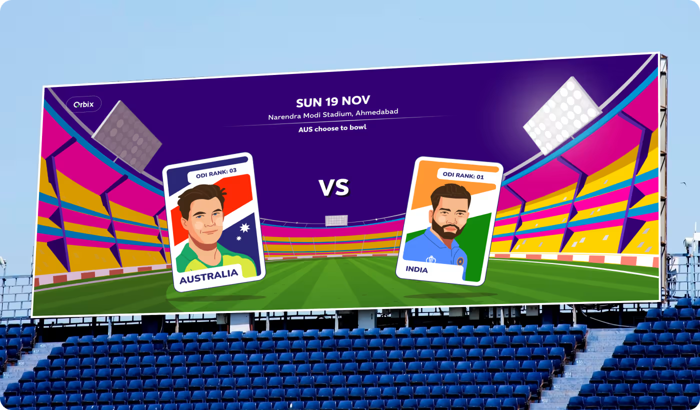
A stronger and more unified tournament campaign
The final design system made the tournament visuals clearer, more consistent, and easier to scale across different campaign needs.
- 10 teams presented in one clear system: The visuals stayed connected while still giving each team its own identity.
- Better team recognition: Color, flag cues, and composition made each team easier to identify at a glance.
- Clearer match communication: Rankings, team names, and match details were easier to place and read.
- More engaging visual storytelling: The artwork added energy and made each tournament asset feel more alive.
Ready To Build
Your Next Project?
.avif)


%201%201.svg)





.svg)


.svg)

.svg)

.svg)
.svg)


.svg)







.avif)



.svg)

