


luxury watch website
.svg)
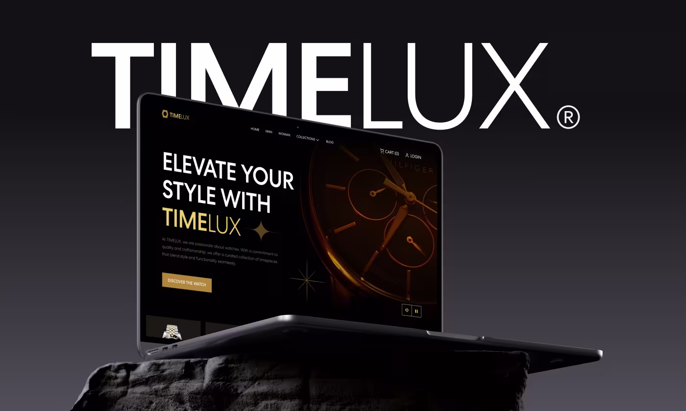
TIMELUX is a luxury watch brand that needed a complete digital overhaul to match its upscale physical presence.
Our task was to translate the feel of a high-end watch boutique into a seamless digital experience. We needed to ensure detailed product specs and premium pricing were displayed clearly without losing the brand's exclusive appeal.
Luxury Shopping Felt Too Complicated Online
Even though TIMELUX sold premium watches, the website experience felt crowded and harder to browse than a luxury store should.
- Crowded product pages: Watch details, pricing, and images compete for attention, making products harder to scan quickly.
- Weak mobile browsing: The mobile experience felt tight and cluttered when users explored collections or compared watches.
- Low luxury feeling: The website visuals did not fully match the premium quality and exclusivity of the watches.
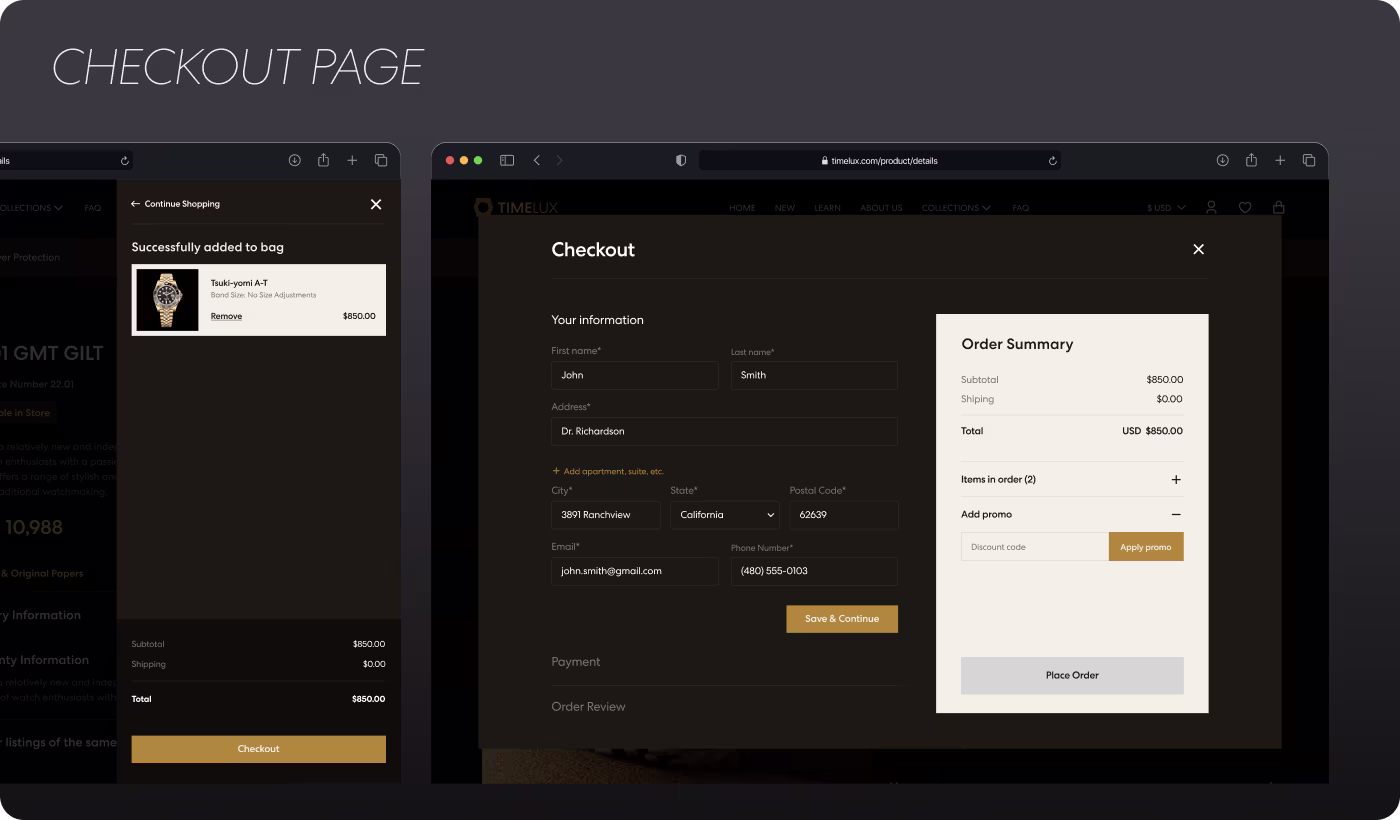
- Confusing checkout flow: Too many elements during checkout made the buying process feel less smooth and trustworthy.
Creating a Cleaner Luxury Shopping Experience
The website was redesigned to make luxury watch shopping feel smoother, easier to browse, and more premium across every screen size.
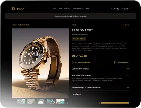
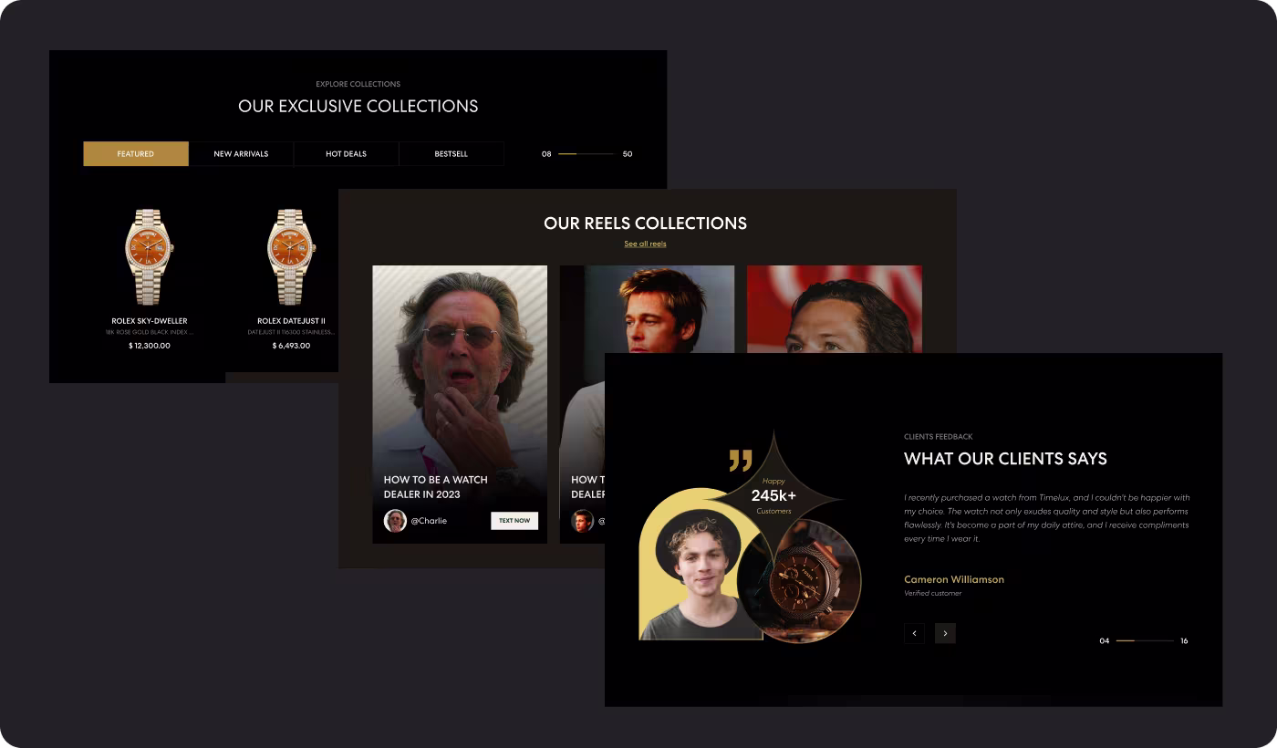
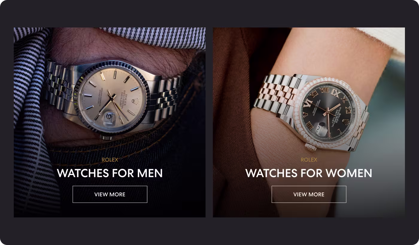
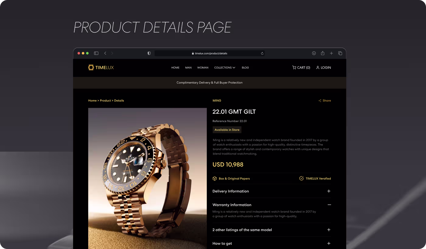
• Simplified product layouts: Product pages were reorganized to separate watch details, pricing, and images more clearly.
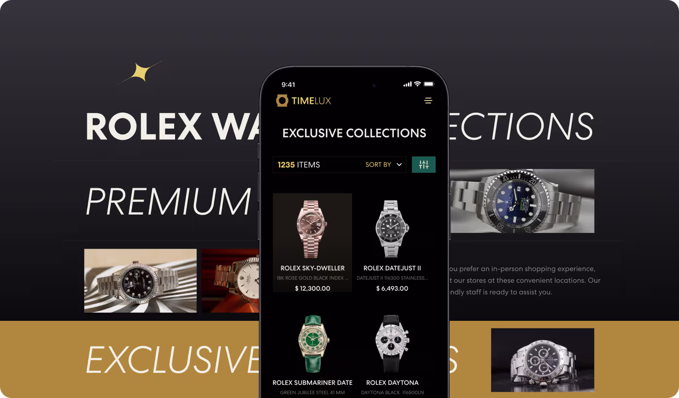
• Improved mobile browsing: Collection pages and product galleries were redesigned to feel cleaner and easier to scroll on smaller screens.
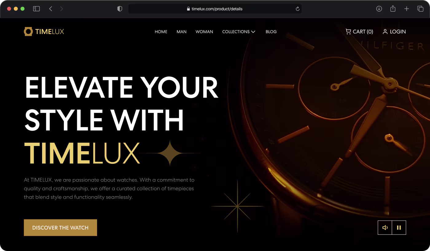
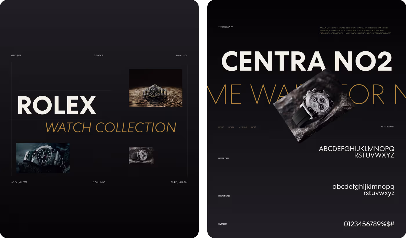
• Stronger luxury visuals: A darker interface, gold accents, and bold typography helped the brand feel more high-end and exclusive.
• Smoother checkout flow: Extra distractions were removed from checkout to help customers complete purchases with more confidence.
Designing a Smoother Luxury Watch Shopping Experience
- Competitor analysis
- User behavior
- Mobile review
- Product research
- Cleaner layouts
- Better hierarchy
- Simpler navigation
- Guided browsing
- Dark interface
- Premium visuals
- Typography styling
- Brand consistency
- Faster checkout
- Reduced friction
- Mobile optimization
- Cleaner interactions
Understanding What Makes Luxury Watch Shopping Feel Premium Online
Research focused on how users browse luxury products online and what helps expensive purchases feel more trustworthy and easier to complete.
- Product browsing analysis: Large watch imagery helped users spend more time exploring collections
- Mobile shopping review: Cleaner layouts made product comparison easier on smaller screens
- Checkout behavior study: Fewer checkout steps reduced hesitation during expensive purchase
- Luxury brand research: Dark interfaces and minimal layouts created a more premium shopping atmosphere
Creating a More Premium Luxury Shopping Experience
TIMELUX needed a shopping experience that matched the quality and exclusivity of its watches. Product pages were redesigned with cleaner layouts, larger imagery, and more organized information so visitors could explore collections without feeling overwhelmed.
Browsing flows were also simplified to help users move through collections, compare products, and understand watch details more comfortably. The final experience focused on making luxury shopping feel smooth, modern, and visually premium across every device.

Improving Mobile Browsing and Checkout Flow
Mobile shopping was redesigned to feel less crowded and easier to navigate for users exploring expensive products on smaller screens. Product galleries, text layouts, and navigation spacing were optimized to create a cleaner browsing experience without losing important product details.
Checkout interactions were also simplified to reduce distractions during high-value purchases. Fewer steps, clearer actions, and better responsive layouts helped make the buying process feel faster and more trustworthy on mobile devices.
Creating a More Premium and Comfortable Online Shopping Experience
The redesigned experience helped TIMELUX feel more modern, trustworthy, and easier to browse across desktop and mobile devices. Cleaner layouts, stronger visuals, and a smoother checkout flow made luxury shopping feel more comfortable for online buyers.
- Better mobile conversions: Completed purchases on mobile increased by 24% after simplifying product browsing and checkout flow
- Longer browsing sessions: Average session duration increased by 35% through larger product galleries and cleaner layouts
- Reduced checkout drop-offs: Simplified checkout interactions helped lower abandoned purchases by 21%
- Stronger luxury presentation: Dark visuals, premium typography, and cleaner spacing created a more exclusive brand experience
Got a project in mind? Let's build it
.avif)


.svg)


.svg)

.svg)


.avif)
