- Good navigation makes complex products feel simple.
- The right navigation pattern changes as your SaaS grows.
- Navigation should match how users think and work - not your internal structure.
- Small navigation improvements can have a big impact on product adoption.
Think about the last time you used a new app. Did you know exactly where to click, or did you spend time hunting through menus?
That's what navigation is supposed to solve. It acts like a map, helping users move from one place to another without stopping to think. When the map is clear, the product feels easy to use. When it's confusing, even simple tasks become frustrating.
In this guide, you'll learn how to design SaaS navigation that helps users find what they need quickly, explore the most common navigation patterns, and choose the best approach for your product.
What is SaaS Navigation Design?
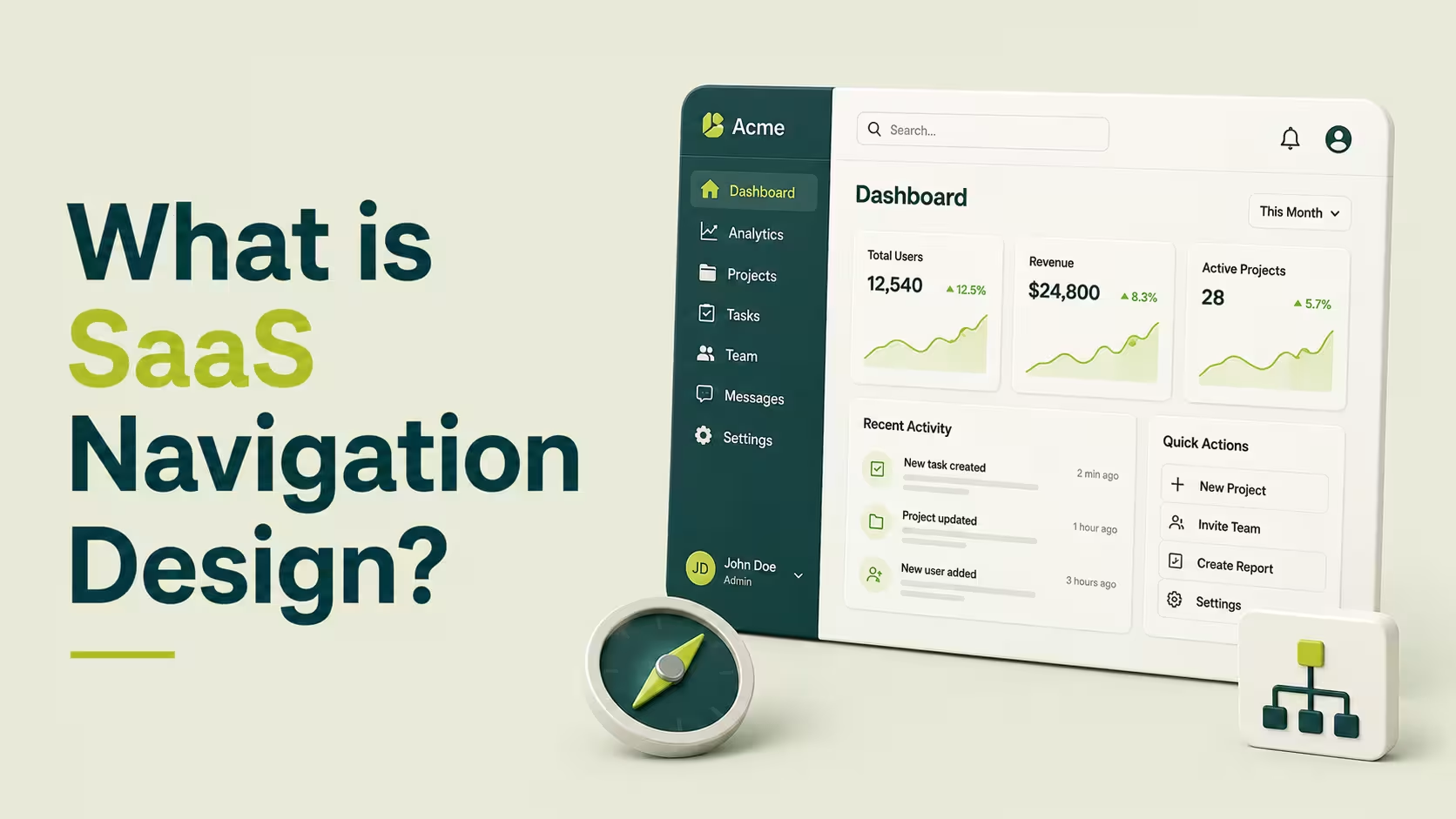
SaaS navigation design is the system that helps users move through your website and product. It includes your main navigation, sidebar, breadcrumbs, search, and other navigation elements that help users find pages, features, and actions quickly.
Good navigation starts with strong SaaS information architecture. This is how your product's pages, features, and content are organized.
A clear information hierarchy groups related items together, making it easier for users to understand where things belong and where to find them. When information is organized logically, users spend less time searching and more time completing tasks.¹²
Effective navigation UX has a direct impact on how people use your product. Users can discover features faster, complete onboarding with fewer obstacles, and return to important pages without getting lost. It also reduces frustration by keeping navigation predictable and consistent across the product.
Principles of Effective SaaS Navigation
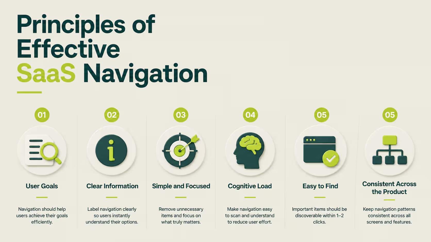
Before choosing a navigation pattern, it's important to understand what makes navigation easy to use. Whether your product uses a top menu, sidebar, or hybrid layout, the same principles apply.
Good navigation helps users find what they need quickly, complete tasks with less effort, and feel confident as they move through your product.
Design Around User Goals, Not Your Company Structure
Users visit your product to complete tasks, not to learn how your company is organized. Instead of grouping pages by internal teams or departments, organize navigation around what users want to do.
For example, a project management tool should make it easy to find Projects, Tasks, and Reports instead of separating features by engineering or marketing categories.
This idea is known as information scent - users should have enough clues to predict where a menu item will take them before they click it. When labels match user expectations, navigation becomes much easier to follow.
Create a Clear Information Hierarchy
A strong SaaS information architecture organizes related pages and features into logical groups. Users shouldn't have to guess whether Billing belongs under Settings or Account, or search through multiple menus to find the same feature.
Think of your navigation like folders on a computer. Similar items belong together, while the most important pages should always be the easiest to reach. A clear information hierarchy makes your product easier to understand from the very first visit.
Keep Navigation Simple and Focused
Every menu item competes for attention. The more choices users see, the longer it takes them to decide where to click.
Instead of adding every page to your primary navigation, highlight only the destinations users visit most often. Less frequently used pages can be grouped into secondary menus, settings, or expandable sections. This keeps navigation clean without making important features harder to find.
Reduce Cognitive Load
Users shouldn't have to stop and think about where to click next. Navigation should feel predictable from one screen to another.
Use familiar labels, place navigation in consistent locations, and avoid renaming the same feature in different parts of your product. Small decisions like these reduce cognitive load, helping users complete tasks faster with fewer mistakes.
Make Primary Actions Easy to Find
Every SaaS product has actions that matter most, such as creating a project, inviting teammates, or starting a free trial. These actions should stand out without overwhelming the rest of the navigation.
Use clear labels, consistent placement, and visual emphasis to guide users toward the next step. When important actions are easy to find, users spend less time searching and more time using your product.
Keep Navigation Consistent Across the Product
Users shouldn't have to relearn navigation as they move between pages. If the menu changes from one section to another without a clear reason, people can quickly lose their sense of direction.
Keep the same navigation structure, terminology, and layout across your marketing website and product wherever possible. A consistent experience helps users build familiarity, making the product easier to learn and more enjoyable to use over time.

Common SaaS Navigation Patterns
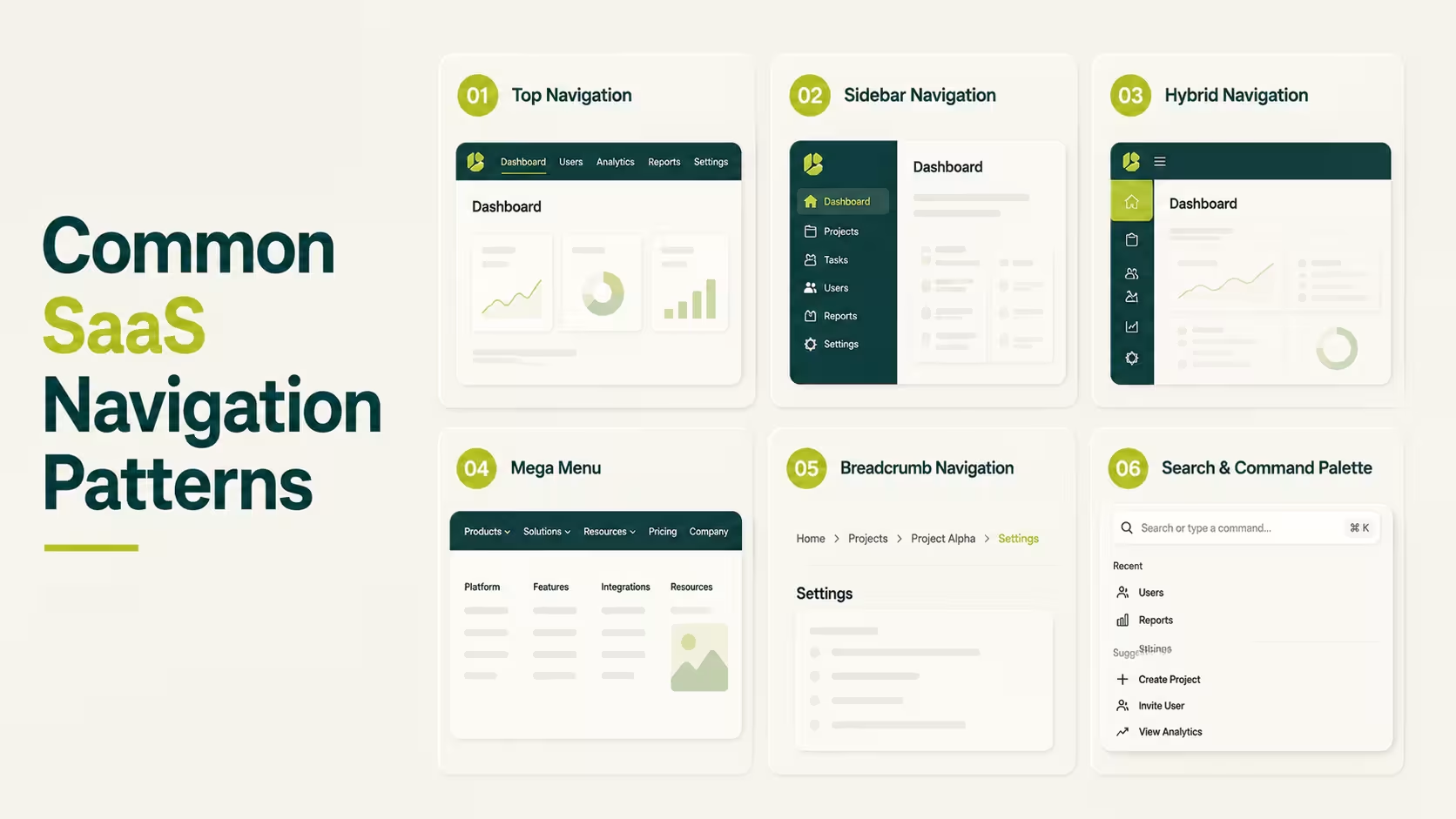
Choosing the right navigation pattern is one of the biggest decisions in SaaS design. Each pattern has its own strengths, and the best choice depends on how your product is built and how people use it.
Here are the most common navigation patterns, along with real SaaS examples and when to use each one.
Top Navigation
When you're building a new SaaS product, keeping things simple is usually the right choice. Most startups don't have dozens of features or pages, so users shouldn't have to dig through complicated menus to find what they need.
That's where top navigation works best. It places the main menu across the top of the page, giving users quick access to the most important sections, such as Products, Pricing, Resources, or Contact. Since everything is visible at a glance, visitors can quickly understand what your product offers and where to go next.
This is why companies like Stripe use top navigation on their websites. Their menus focus on the pages new visitors are most likely to explore instead of trying to show every product detail at once. The result is a clean, easy-to-scan navigation that helps users make decisions faster.
As your website grows, it's important to keep the main navigation focused instead of adding every new page to the menu. IBM's Carbon Design System recommends limiting global navigation to the most important destinations so users aren't overwhelmed with unnecessary choices.
Looking for more inspiration? Browse these SaaS Website Design Examples to see how leading SaaS companies structure their navigation.
Sidebar Navigation
Imagine editing a project and needing to jump to reports, settings, or another workspace every few minutes. Opening a menu every time quickly becomes frustrating.
A sidebar solves that problem by keeping navigation visible while users work. Instead of searching for pages, they can move around the product with a single click. That's why sidebars are common in dashboards, project management tools, and other products people use every day.
Slack reply on this approach. Their sidebars stay on screen, making it easy to switch between conversations, projects, and tasks without breaking focus.
A well-designed sidebar is one of the foundations of a great SaaS dashboard. Learn more in our SaaS Dashboard Design Complete Guide.
Hybrid Navigation (Top + Sidebar)
At some point, even a sidebar isn't enough. Large SaaS products need to organize both where users are and what they're working on. Trying to fit everything into one menu usually creates more confusion than clarity.
Hybrid navigation solves this by giving each menu a different job. The top navigation helps users switch between products, workspaces, or account settings. The sidebar focuses on the pages and tools inside the current workspace. Instead of one overloaded menu, users get two smaller menus that are easier to understand.
HubSpot uses this approach to separate its different hubs, such as Marketing, Sales, and Service, while the sidebar changes to show the tools inside each hub
Designing scalable navigation is a core part of successful SaaS product design. As products grow, navigation should grow with them instead of becoming more complicated.
Mega Menu
A simple dropdown works when your website has a few pages. But what happens when you have products, solutions, pricing, resources, documentation, blog posts, and support - all in the same navigation?
Instead of creating a longer dropdown, you scan everything at once instead of hunting through endless lists.
Microsoft uses a mega menu to organize its products, business solutions, downloads, and learning resources without overwhelming visitors.
A well-organized navigation starts with a clear content structure. Our SaaS Homepage Design Guide explains how navigation and page hierarchy work together to improve the user journey:
Breadcrumb Navigation
Finding the right page is only half the journey. Once users are deep inside a product, they also need to know where they are.
That's where breadcrumb navigation comes in. It shows the path to the current page, such as:
Home → Projects → Marketing → Campaign
This makes it easy to understand your location and jump back to a previous section with a single click.
This pattern is especially useful in products with lots of nested pages. Jira uses breadcrumbs to help users move between projects, boards, and issues. Instead of replacing the main navigation, breadcrumbs give users a sense of direction as they explore deeper levels of the product.
Material Design recommends using breadcrumbs as a supporting navigation pattern to help users stay oriented inside complex products:
Search & Command Palette
There comes a point where clicking through menus is simply too slow. When a product has hundreds of pages, settings, and features, users often know exactly what they need - they just want the fastest way to get there.
That's why modern SaaS products treat search as navigation. Instead of opening menu after menu, users can press Cmd + K (or Ctrl + K) and type what they're looking for. In just a few keystrokes, they can jump to a page, open a project, change a setting, or even trigger an action.
Notion uses its command palette to instantly open pages, databases, templates, and settings. Linear builds almost the entire product around keyboard shortcuts, letting experienced users navigate faster than they could with a mouse.
As dashboards become more feature-rich, search becomes just as important as the navigation menu. Our SaaS Dashboard Design Complete Guide explains how navigation evolves as products become more complex:
Which SaaS Navigation Pattern Should You Choose?
The best navigation pattern isn't the one used by the biggest SaaS company - it's the one that matches your product today. A startup with five features doesn't need the same navigation as an enterprise platform with hundreds of pages and thousands of users.
As your product grows, your navigation should grow with it.
For Startups and Simple SaaS Products
If you're building an MVP or an early-stage SaaS product, keep your navigation as simple as possible. Most users are still learning what your product does, so they shouldn't have to explore multiple menus just to find the basics.
A top navigation is usually the best choice because it highlights the most important pages without adding unnecessary complexity. If your product only has a handful of core features, resist the temptation to build a navigation system designed for a much larger product. You can always expand it later.
For Growing B2B SaaS Products
As your product evolves, so do your users' expectations. New features, dashboards, reports, and integrations all compete for space, making a simple top menu harder to manage.
This is usually the right time to introduce a sidebar or hybrid navigation. A sidebar gives users quick access to frequently used tools, while a hybrid layout separates global navigation from day-to-day work.
The goal isn't to add more menus, it's to keep the product organized as it grows.
For Complex & Enterprise SaaS Platforms
Enterprise software often serves different teams with different responsibilities. An administrator doesn't need the same navigation as a sales representative, and neither works the same way as a support agent.
At this stage, navigation becomes a combination of patterns. Hybrid navigation provides structure, role-based navigation keeps menus relevant to each user, breadcrumbs help users stay oriented, and search or command palettes make large products easier to navigate. Instead of relying on one pattern, enterprise platforms combine several to create a smoother experience.
Common SaaS Navigation Mistakes to Avoid
Even the right navigation pattern can fail if it's poorly organized. The goal isn't to add more menus or links - it's to help users find what they need with as little effort as possible. Here are some of the most common mistakes to avoid.
- Adding too many navigation items: A crowded menu increases cognitive load and makes it harder for users to decide where to click. Keep your primary navigation focused, and move secondary pages into submenus or settings.
- Using vague menu labels: Labels like "Solutions," "Resources," or "Platform" often mean different things to different people. Use clear, descriptive labels that tell users exactly what they'll find.
- Organizing navigation around your company: Users don't care which department owns a feature. Group pages around user goals and workflows instead of your internal team structure.
- Hiding important features: If users rely on a feature every day, they shouldn't have to search multiple menus to find it. Keep your most-used tools visible and easy to access.
- Using inconsistent navigation: Changing menu names, layouts, or locations across different pages forces users to relearn your product. Keep navigation consistent from one screen to the next.
- Ignoring mobile navigation: A menu that works well on desktop can become frustrating on a phone. Make sure your navigation is responsive and easy to use on every screen size.
- Skipping user testing: The best navigation decisions come from watching real users - not assumptions. Test your navigation regularly and improve it based on how people actually use your product.
Frequently Asked Questions
What is SaaS navigation design?
SaaS navigation design is the way users move through a SaaS product or website. It includes menus, sidebars, breadcrumbs, search, and other navigation patterns that help users quickly find pages, features, and actions.
Which is better: sidebar or top navigation?
It depends on your product. Top navigation works well for simple SaaS websites and products with a few main sections. Sidebar navigation is better for dashboards and feature-rich applications where users switch between pages frequently.
How many items should a SaaS navigation menu have?
There isn't a fixed number, but most SaaS products keep their primary navigation focused on the most important sections. If your menu keeps growing, it's usually a sign that you need a sidebar, mega menu, or better information architecture.
What is progressive disclosure in navigation?
Progressive disclosure is a UX technique that shows only the most important navigation options first and reveals additional options when users need them. This helps reduce clutter and makes navigation easier to understand.
What is the difference between object-oriented and workflow-based navigation?
Object-oriented navigation organizes menus around items like Projects, Files, or Customers. Workflow-based navigation organizes them around tasks, such as Create, Review, or Publish. The best choice depends on how users naturally complete their work.
How do you design navigation for multiple user roles?
Start by identifying what each role needs to accomplish. Then show only the pages and features that are relevant to that role. This keeps navigation simpler and reduces unnecessary complexity.
When should a SaaS product use hybrid navigation?
Hybrid navigation works best when a product has grown beyond a single menu. It combines a top navigation for global sections with a sidebar for day-to-day tasks, making large products easier to organize and navigate.
Why is information architecture important in SaaS navigation?
Information architecture determines how pages and features are grouped before navigation is designed. A clear structure helps users find what they need faster, reduces confusion, and makes the product easier to learn.
Final Thoughts
Good SaaS navigation isn't about adding more menus or following the latest design trends. It's about helping users find what they need with the least amount of effort. The simpler and more predictable your navigation feels, the easier it becomes for people to learn your product, complete tasks, and keep coming back.
Start with the navigation pattern that fits your product today, then improve it as your product grows. Whether you're building an MVP or an enterprise platform, every navigation decision should make the experience clearer - not more complicated.
.avif)