- What Are Dark Patterns in UX Design?
- Types of Dark Patterns in UX Design
- Examples of Dark Patterns in UX Design
- Why Dark Patterns Harm User Experience
- Dark Patterns vs. Ethical Persuasive Design
- How Designers Can Avoid Dark Patterns
- A Practical Way to Identify Dark Patterns in SaaS Products
- Legal and Consumer-Protection Considerations
- Frequently Asked Questions
- Final Thoughts


Dark Patterns in UX Design: Types, Examples, and Ethical Alternatives
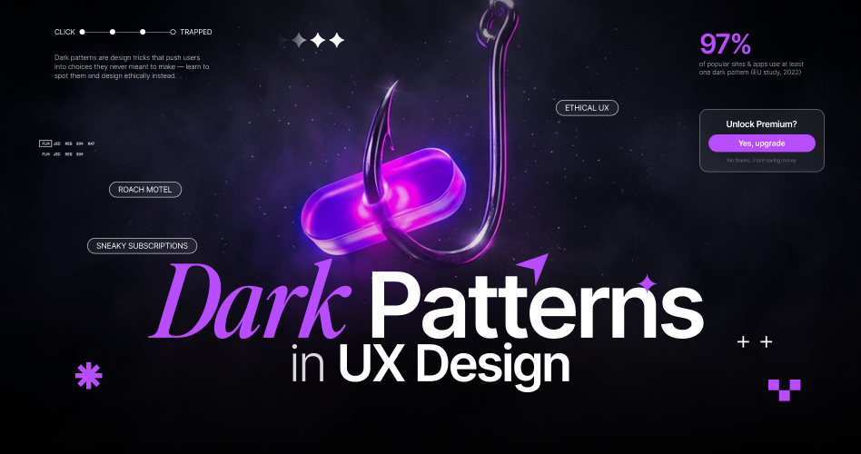
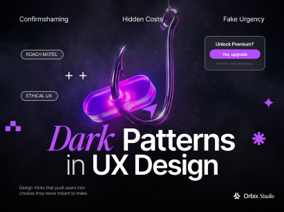
- Dark patterns are deceptive design choices that manipulate users into making decisions they might not otherwise make.
- The five main types of dark patterns are nagging, obstruction, sneaking, interface interference, and forced action.
- Common examples include hidden fees, difficult cancellation processes, fake scarcity messages, and misleading consent banners.
- Poor UX does not always mean dark patterns. The key difference is whether the design works against the user's interests.
- Dark patterns can damage user trust, compromise privacy, cause unwanted purchases, and create frustrating experiences.
- Ethical persuasive design helps businesses guide decisions without misleading users or limiting their choices.
Every button, message, and interaction in a digital product influences how people make decisions. But what happens when those design choices deliberately work against users?
That's where dark patterns come in. Also known as deceptive design patterns, they use misleading information, unnecessary friction, and psychological pressure to influence user behavior. A seemingly harmless pop-up, hidden cancellation option, or preselected checkbox can turn an ordinary interaction into a frustrating experience.
For UX designers and product teams, recognizing these practices is the first step toward building more ethical products. This guide breaks down the five major types of dark patterns, explores practical examples, and explains how to replace deceptive interactions with user-centered design alternatives.
What Are Dark Patterns in UX Design?
Dark patterns are deceptive design choices that manipulate users into taking actions they might not otherwise choose. They appear in websites and apps through hidden cancellation buttons, unexpected checkout fees, misleading messages, or confusing interface elements.
The word "dark" has nothing to do with dark mode or black backgrounds. It describes the intent behind the design. Instead of helping users make informed decisions, these patterns prioritize business interests at the expense of user choice.
UX designer Harry Brignull coined the term in 2010. In 2018, Gray and colleagues published an academic study that organized these practices into five high-level strategies. The U.S. Federal Trade Commission (FTC) also discusses similar practices in its report, Bringing Dark Patterns to Light.
At the heart of this issue is user autonomy, or a person's ability to make their own decisions. Good UX design supports that freedom. Dark patterns undermine it by making certain choices harder to understand or access.
How Do Dark Patterns Work?
Dark patterns work by manipulating how users see, understand, and interact with their available choices. They use interface elements, misleading information, and unnecessary friction to steer people toward actions that benefit a business. Instead of helping users make informed decisions, the design quietly influences their behavior.
This often happens through something called choice architecture. It describes how an interface presents, organizes, and prioritizes different options.
For example, a website might make its preferred action more visible while making alternatives harder to find. Choice architecture itself isn't deceptive. It becomes a problem when the arrangement works against the user's interests.
You can understand how a dark pattern works by following this sequence:
What the user wants → What the interface does → The mechanism → What can go wrong → The fairer alternative
Consider someone trying to cancel a subscription. The cancellation option is hidden, the interface adds several confirmation screens, and each step presents another offer to stay.
This creates unnecessary friction and makes leaving harder than signing up. The result? The user might give up and continue paying for a service they no longer want.
Most dark patterns rely on a few common techniques:
- Hidden information: Important details, such as additional fees or cancellation terms, are difficult to find.
- Pressure: Countdown timers, repeated pop-ups, and guilt-based messages push users to act quickly.
- Friction: The business's preferred action takes one click, while the user's preferred action requires several steps.
- Defaults: Options are preselected to encourage decisions that benefit the business, often without users noticing.
However, these techniques aren't automatically deceptive. A confirmation step before deleting an account can prevent accidental data loss. A preselected setting can also make a product easier to use. The real difference is whether the design respects the user's intentions and keeps alternative choices accessible.
Types of Dark Patterns in UX Design
Researchers have sorted dark patterns in several ways. This article uses the five high-level strategies from Gray et al. (2018) because they're easy to remember and they come from UX practice. A separate study, Mathur et al. (2019), uses its own categories for shopping websites. The two systems overlap in places, so this article keeps them apart and says which one it's using.
Nagging
Nagging means repeated interruption that's hard to stop. Picture an app that asks you to turn on notifications every time you open it, with only "Yes" and "Maybe later" as choices. There's no "No, stop asking." A useful reminder appears once, at a sensible moment, and respects your answer.
Obstruction
Obstruction means making a task harder than it needs to be, hoping you'll give up. Gray et al. include a pattern called the "roach motel": signing up takes a single click, but leaving feels like a maze. The user's goal is simple, and the interface adds speed bumps.
Sneaking
Sneaking means hiding, disguising, or delaying information that matters. Two common examples:
- Hidden costs: the price looks low until the last step of checkout, when extra fees appear.
- Forced continuity: a free trial turns into a paid plan with no clear reminder.
Interface Interference
Interface interference means the screen is arranged so certain options stand out and others fade away. In plain terms, the layout does the persuading. Examples include:
- Preselection: a box is already ticked in the company's favor.
- Confirm shaming: the decline button uses guilt, such as "No thanks, I don't like saving money." This term is widely used in the field. Gray et al. use a related label, "toying with emotion."
- Misdirection: visual emphasis pulls your eye toward the option the company prefers.
Forced Action
Forced action means you must do something extra to continue. Sometimes that's fair, like entering a password to open an account. It becomes a problem when the extra step has nothing to do with your goal, such as agreeing to marketing emails just to finish checking out.
Quick reference
These groups are one way to organize a messy area. Real screens often mix several tricks at once, and that's why the examples below name more than one mechanism.
Examples of Dark Patterns in UX Design
Here are 3 examples in depth, then a few shorter ones. A note on labeling: the real cases below come from official FTC records and are historical. The screen descriptions are hypothetical illustrations written to teach. They aren't real products.
Each example follows the same order: what the user wants, what the screen does, which mechanism applies, what supports the claim, what could go wrong, and what a fairer design looks like.
Example A: A subscription that's easy to start and hard to cancel
User goal: Stop paying for a monthly plan.
What the screen does (hypothetical): Signing up took one button. Canceling means finding a buried Account page, opening "Manage plan," answering a survey, rejecting three discount offers, and confirming twice. The real "Cancel" link is small gray text under a large "Keep my plan" button.
Mechanism: Obstruction, with interface interference. If the user was never reminded about renewal, forced continuity may also apply.
Evidence in the real world: In 2025, Amazon settled with the FTC over allegations about how Prime enrollment and cancellation worked. The settlement included a $1 billion civil penalty and up to $1.5 billion in consumer refunds. Two cautions apply. A settlement is not a court ruling that a company broke the law. And this is a historical case, so it says nothing about how Amazon's screens look today.
What could go wrong: People lose money and time on something they tried to leave.
Fairer design: Put "Cancel subscription" where people already look for billing. Say what happens next, such as "You'll keep access until June 30." A retention offer is fine, as long as declining it takes one click.
Example B: A consent banner that makes "No" hard to find
User goal: Use a website without being tracked more than necessary.
What the screen does (hypothetical): A cookie banner shows a bright "Accept all" button. Declining means clicking a gray "More options" link, which opens a long list of switches that are already turned on.
Mechanism: Interface interference, obstruction, and preselection working together.
Evidence in the real world: European privacy regulators have published guidelines on deceptive design in social media interfaces. Those guidelines apply to the EU's GDPR, so they aren't U.S. law. They're useful here because they describe how consent screens can fail the person using them.
What could go wrong: The person shares more data than they intended, because agreeing took one click and refusing took many.
Don't overclaim: A larger "Accept" button isn't automatically a violation. What matters is whether the person can see, understand, and use the other choice without extra effort.
Fairer design: Give "Accept" and "Decline" equal visual weight. Leave non-essential tracking off by default. Explain in plain words what each choice does.
Example C: Fees that show up at the last step
User goal: Buy something at the price shown.
What the screen does (hypothetical): A ticket is listed at $40. After you enter your name, address, and card number, the total jumps to $58 because of a "service fee" and a "processing fee" never mentioned earlier.
Mechanism: Sneaking, specifically hidden costs.
Why it works: By the time the real price appears, you've already invested several minutes. Starting over feels wasteful, so many people continue. The design relies on that sunk effort.
What could go wrong: The person pays more than they agreed to, or abandons the purchase and feels tricked.
Fairer design: Show mandatory fees as early as possible, ideally on the product page, and make sure the first total matches the final one. The same idea applies to software pricing. For examples of clear plan comparison, see our guide to SaaS pricing page design.
Shorter examples
- Confirmshaming: A decline button reading "No thanks, I'd rather pay full price."
- Fake scarcity: "Only 2 left!" shown when stock isn't actually limited. True low-stock notices are fine. Invented ones are the problem.
- Forced action: A store that requires an account before you can buy one item, when guest checkout would work.
- Nagging: A pop-up asking for a review every time the app opens.
- Unintended purchases: The FTC's 2023 final order against Epic Games, maker of Fortnite, required $245 million in consumer refunds. The FTC alleged that confusing purchase controls led players to make charges by accident. This is separate from Epic's children's-privacy settlement.
Dark patterns in e-commerce
Online stores are where dark patterns have been studied most. They're a natural fit: there's a clear goal (buy), clear friction points (cart, checkout), and clear money at stake. Hidden fees, fake urgency, and pre-ticked add-ons all show up here. The next section covers what researchers found.
Why Dark Patterns Harm User Experience
Some of the harm has been measured. Some are reasonable expectations. It helps to keep the two apart.
What research has measured. In 2019, Mathur and colleagues examined about 11,000 shopping websites. They found dark patterns on roughly one in ten of them. That is a specific sample of shopping sites from that time. It doesn't tell us how common dark patterns are across all websites or all SaaS products today. The OECD has also reviewed how dark commercial patterns can affect consumers.
What's plausible, based on how these designs work:
- Money: surprise charges and subscriptions nobody meant to keep.
- Privacy: sharing more personal data than intended.
- Time and effort: getting stuck in flows built to wear you down.
- Informed choice: deciding without seeing the key facts.
- Trust: feeling tricked can make people less willing to return. That's a reasonable expectation, not a number measured in this article.
Trust deserves a moment on its own. A product can win a quick sign-up with a trick and lose the person's goodwill for good. Sound UX design principles put the user's real needs first for exactly this reason.
Dark Patterns vs. Ethical Persuasive Design
Here's the question beginners ask most: where does honest persuasion end and deception begin?
Design is always persuasive. A clear "Start free trial" button persuades. So does a real customer review. That's normal and healthy. Nielsen Norman Group makes a related point: what matters is whether the design respects the user's understanding and choice.
Three-question test
- Is the information true?
- Can the person see and understand their options?
- Can they act on their choice without extra pressure or effort?
If any answer is "no," look closer. If all three are "yes," you're probably looking at ordinary persuasion.
Dark patterns vs. bad UX
A confusing screen isn't automatically a dark pattern. A messy menu, vague labels, or a slow form may just be mistakes. Look for a consistent pattern of benefit. Does the confusion keep landing on the company's side? Would a fix be obvious and cheap, yet it hasn't happened? Those signs point toward deception. For everyday problems that aren't deceptive, see these common SaaS UX mistakes.
The same screen can also change meaning with context. A pre-ticked "Save my card" box on a store you use weekly is a convenience. The same box on a one-time donation, with no clear explanation, is a bigger concern. Always ask what the person is trying to do.
How Designers Can Avoid Dark Patterns
Generic advice like "be transparent" doesn't help much. These are specific changes, each paired with the problem it fixes and why it works.
1. Make important options easy to find. Fixes hidden cancel buttons and buried privacy settings. People can only choose what they can see.
2. Show key information before the decision, not after. Fixes hidden fees. A choice made without the facts isn't fully informed.
3. Use honest wording on buttons. Fixes confirm shaming. "No thanks" respects the person. "No, I hate saving money" pressures them.
4. Give serious choices equal visual weight. Fixes unbalanced consent banners. If one answer is far easier than the other, the choice isn't really free.
5. Make leaving as easy as joining. Fixes roach-motel flows. If signing up took one click, canceling shouldn't take ten.
6. Limit reminders, and accept "no." Fixes nagging. A respectful design remembers the answer.
7. Test the redesign. A cleaner look doesn't prove the fix works. Run a short usability test: ask people to complete the task, such as canceling a plan, and watch where they hesitate. Then ask them to explain in their own words what will happen after they click. If they misunderstand, the design needs another round.
A Practical Way to Identify Dark Patterns in SaaS Products
If you work on a software product, here's a focused method for checking one journey: sign-up, billing, consent, or cancellation. It isn't a full audit. For the wider process, read our guide to the UX audit process. This method asks one narrow question: could this step mislead or trap someone?
The nine-field assessment
For each suspicious step, fill in these fields:
The evidence ladder
The "Confidence" field is where beginners go wrong, so here's a simple way to fill it in. This ladder is an editorial working tool, not a published research standard. It helps you say how strong your finding is before you call something a dark pattern.
- Observed: you saw the behavior once.
- Reproduced: you saw it again, on another device or account.
- Documented: you have dated screenshots or a screen recording.
- Tested: real users attempted the task and the problem showed up in their behavior.
A finding at step 1 is a lead. A finding at step 4 is a case. Keep your language in line with the rung you've reached: "appears to," "may," and "could" for the first two, firmer wording only once you have testing behind you.
A worked example (hypothetical)
This is an invented example for teaching. It's not a real client audit or a real company.
Notice what the table does not claim. It doesn't say the redesign will raise or lower revenue. It only says what to check.
Legal and Consumer-Protection Considerations
Not all dark patterns are illegal, and the rules differ by country. This section is general information, not legal advice.
In the United States, the FTC has acted against some deceptive interface practices, including the Amazon and Epic Games matters above. Those cases involved specific allegations and agreements. They don't automatically apply to every similar design.
One update matters for anyone working on subscriptions. The FTC finalized an amended "Click-to-Cancel" rule in 2024. On July 8, 2025, the Eighth Circuit Court of Appeals vacated that amendment, meaning it was struck down.
The earlier Negative Option Rule was reinstated, and the FTC reopened the question of amendments in 2026. See the Federal Register notice. The 2024 amendment is not currently in force. This area changes quickly, so check the latest status before relying on it.
Outside the U.S., rules like the EU's GDPR affect consent screens, but only in certain regions. If you're building for a specific market, talk to a qualified lawyer.
Frequently Asked Questions
Are dark patterns illegal?
Not always. Some may break consumer-protection or privacy rules, depending on the place, the facts, and the regulator. Others can harm trust without being clearly illegal. A legal question about a specific design needs a lawyer.
What is a dark pattern in simple words?
It's a screen designed to push you toward something you didn't plan to do, or to make something you did plan to do much harder.
Is a confusing screen always a dark pattern?
No. Poor design and deceptive design can look alike. Look for whether the confusion keeps benefiting the company at the user's expense, and whether you have evidence.
Are all persuasive interfaces dark patterns?
No. Honest reviews, clear calls to action, and true scarcity messages are normal. The question is whether people can still understand their options and choose freely.
How can a team test whether a redesign is better?
Run a usability test on the exact task. Look for fewer mistakes, less hesitation, and a correct understanding of the outcome. Don't claim gains in sales or retention unless you've measured them.
Final Thoughts
Dark patterns work by making the company's preferred action easy and the user's preferred action hard or unclear. Once you know the five strategies (nagging, obstruction, sneaking, interface interference, and forced action), these tricks get much easier to spot.
If your team would like another set of eyes on a sign-up, billing, or cancellation flow, you can explore our UI/UX design services.