- The Problem With AI Dashboard Design
- Anatomy of a Trustworthy Prediction Card
- Five Ways to Visualize Confidence, Compared
- Why Fake Precision Costs You More Than No Score
- Make Confidence Indicators Everyone Can Actually Read
- How Orbix Studio Approaches This in Practice
- What Good Looks Like Once You Ship This
- Frequently Asked Questions
- Conclusion


.svg)

%201%201.svg)
AI Dashboard Design Best Practices for Showing Predictions Clearly
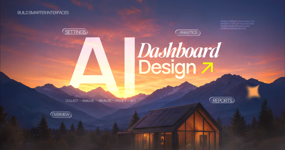

- AI dashboard design fails when it shows predictions without a way to judge how much to trust them.
- Pair every forecast with a confidence signal, tie it to an action, and never fake the precision.
- The common mistake: a decorative percentage that isn't backed by real model calibration.
A dashboard that predicts without showing confidence is guessing out loud.
AI dashboard design best practices matter because forecasts now shape real SaaS decisions: which account to save, which invoice to flag, which lead to prioritize, and which risk to review first. But a prediction alone doesn’t tell a team how much trust it deserves.
That’s where the interface earns or loses credibility. A churn card with “High Risk” and no confidence signal pushes every account into the same queue. A better card shows the forecast, the confidence level, the reason behind it, and the next action in one readable block.
The Problem With AI Dashboard Design
A prediction without a confidence score gives a user no way to judge risk before acting on it. Meaning the dashboard hands over a number and hides the one detail that tells the reader whether to trust it or double check it. Gmail's spam filter solves this by pairing every flag with a probability score instead of a flat yes or no. A borderline email gets a second look instead of an automatic delete.
A churn risk card can hide this entirely: "High Risk" next to a name, no signal on how sure the model is. A support team then treats every flagged account the same way, burning outreach hours on accounts that were never close to leaving. The cost shows up in wasted hours, not in the model itself. A team chasing five low-risk accounts a week loses the exact time it needed for the two accounts actually worth saving.
This is the same failure pattern covered in dashboard design best practices, where cluttered hierarchy hides the one number a user actually needs. Confidence works the same way: bury it, and the user can't act correctly even when the underlying model is right. This exact pattern shows up in the audits behind SaaS UX mistakes.
A prediction without a confidence score is a guess wearing a suit. Fixing this doesn't start with a chart. It starts with a component.
Anatomy of a Trustworthy Prediction Card
A trustworthy prediction card has five parts. They are the forecast, the confidence signal, a short explanation, a verification path, and a fallback state for moments a model can't answer reliably. Leave out any one of them and the card either overclaims or underexplains.
AI UX Playground's confidence score pattern documents this exact component across IBM Watson and Google Search, and the shape holds regardless of industry. Here's what each part does:
- The forecast: the actual number or label, stated plainly. "Demand is projected to drop 12% in the next 14 days."
- The confidence signal: a badge, bar, or label showing how sure the model is, placed next to the forecast, not buried in a tooltip.
- A short explanation: one line answering "why this number," not a full model breakdown.
- A verification path: a link or button the user can click to check the source data behind the call.
- A fallback state: what shows up when the model has no reliable answer, so the card never fakes confidence it doesn't have.
The fallback state matters as much as the badge itself. A support triage tool that admits "not enough data to score this ticket" prevents a wrong auto-route. That costs far more than an honest "I don't know."
Card layouts that skip hierarchy tend to bury this structure under decorative elements. The teardown behind bento grid dashboard aesthetics covers this trade-off directly. A grid that looks clean in a portfolio shot often hides the one interactive element a user needs to click.
A prediction card that looks polished but skips the verification path is a trap dressed as a feature. That exact trap shows up in the patterns cataloged in B2B SaaS dashboard examples.
Five parts, one job: let the reader decide how much to trust the number without reading a model doc. Once the card has all five parts, the next decision is how to render the confidence signal itself.
Five Ways to Visualize Confidence, Compared
Five visualization methods cover almost every dashboard context. They are a numeric percentage, a label bucket, a progress bar or badge, a gauge, and error bars or a probability band. Each one trades precision for scannability differently.
Picking the wrong one for your audience turns a useful signal into noise. AI Design Patterns' confidence visualization guide puts it directly. A decorative percentage that isn't backed by real calibration is worse than showing nothing at all.
Strong dashboards often combine two methods instead of picking one. A label bucket next to a thin progress bar gives a fast scan and a precise read in the same glance. Neither user is forced to do the same math.
Skip the indicator entirely when the underlying model has no real variance to report. A spell checker that flags typos with 99.9% consistency doesn't need a confidence badge, since the badge would just be decoration on a fact.
The pattern covered in SaaS dashboard design's complete guide applies directly here. Match the visualization to how the reader will act on it, not to what looks impressive in a design file. A finance team reading a revenue forecast wants the probability band. A support agent triaging fifty accounts wants a label bucket scannable in half a second.
Multi-tenant products complicate this further, since different customer segments read confidence signals differently. The framework in multi-tenant dashboard design covers how to let each tenant's admin choose a default view. That is exactly the flexibility a confidence indicator needs. Revisit the choice whenever a new user segment joins, since a method built for power users can overwhelm someone seeing their first prediction card.
Match the method to the decision, not to the chart library you already have installed. Choosing the right visualization solves half the problem. The other half is making sure the number behind it is honest.
Why Fake Precision Costs You More Than No Score
A confidence score only works if it's calibrated, meaning an 80% label corresponds to being right roughly 80% of the time. A fabricated 92% manufactures trust that shatters the first time a high-confidence answer turns out wrong. At that point the user stops trusting every number on the dashboard, not just the one that failed.
Here's where this shows up in practice. A team rebuilding an admin dashboard for a mid-market client added confidence badges to every AI-flagged anomaly without validating the model against holdout data. Support tickets spiked within a month because the badges implied certainty the model never earned.
Calibration isn't a one-time check either. A model trained on last year's data drifts as customer behavior shifts. The validation step needs to repeat on a schedule, not just at launch.
The fix wasn't a design change. It was a validation step added before the badge ever shipped. This connects directly to the rebuild patterns in SaaS admin dashboard rebuilds, where the actual fix usually sits upstream of the interface.
The same logic applies to any AI-native surface covered in AI-driven UX patterns for SaaS. That visual layer can only be as honest as the model feeding it. Before adding a single confidence badge, run this checklist with your data team:
- Has the model's confidence score been validated against real outcomes, not just training accuracy?
- Does 80% actually mean right 80% of the time across the segments your dashboard serves?
- Is there a documented recalibration schedule as the underlying data shifts?
Tip: If your data team can't answer the first question with a number, don't ship the badge yet. Ship a fallback state instead and revisit once the model is validated.
A calibrated 70% is worth more than a fabricated 95%, every single time. Getting the number honest is step one. Making sure everyone can actually read it is step two.
Make Confidence Indicators Everyone Can Actually Read
Color-only confidence indicators fail for about 8% of men, who have red-green color blindness according to the National Eye Institute. They fail just as often for anyone using a screen reader.
A red badge means nothing to a user who can't distinguish it from green. It means nothing at all to software reading the page aloud. Pair every color with a label, an icon, or both.
Accessibility in UI/UX design covers the contrast and labeling rules that apply directly to confidence badges. Three rules matter here: a 4.5:1 contrast ratio for text and a text equivalent for every color-coded state. Add keyboard access to any tooltip holding the explanation layer. Skipping these locks out a real share of the exact users the dashboard was built to serve.
Animated confidence bars need a reduced-motion fallback too. A pulsing badge that updates in real time can trigger discomfort for users with vestibular sensitivity. Respect the operating system's reduce-motion setting and swap in a static state instead.
Test every confidence color against both light and dark themes before shipping. A green badge that reads clearly on a white background can lose contrast entirely against a dark navy dashboard. That gap slips through review more often than teams expect.
Confidence labels need translation too if the product ships beyond English. "High confidence" carries a different weight translated literally into some languages. Work with a linguist or a native reviewer rather than a direct machine translation for anything tied to trust.
Orbix Studio's Investiq project, an investment tracking app, sits squarely in this problem space. It shows projected returns and their uncertainty to a general audience, not just data specialists.
The AI Travel Booking project carries the same challenge for recommendation confidence. A suggested itinerary needs a reason a traveler can actually read, not just a trust score.
The broader thinking behind this sits in Orbix Studio's AI product design guide, which treats explainability and accessibility as one problem, not two separate checklists.
An indicator only works if every user in the room can actually read it, not just the ones with typical color vision. Once the component is accessible, the last piece is proving the thinking holds up across a real product.
How Orbix Studio Approaches This in Practice
Orbix Studio treats confidence visualization as a data problem first and a visual problem second. Before a single badge gets designed, the process starts with the same question raised earlier. Is the underlying score calibrated, and what happens on screen when it isn't? That question shapes every screen that follows.
That process starts with a short technical audit: what does the model actually output, a raw score or a bucket. Then the team traces where that value lives in the data pipeline. The answer decides whether the fix is a validation sprint or a full redesign.
The broader process sits inside Orbix Studio's SaaS UX design guide. It walks through how visual decisions get sequenced after the data and information architecture are locked, not before.
AI is changing design to cover the wider shift this fits into. AI-native products need design systems that treat uncertainty as a first-class state, not an edge case bolted on later.
Three portfolio projects sit in adjacent problem spaces. Upmatch, a job recruiting platform, works with match scores between candidates and roles, a category where implying false precision erodes trust fast.
Names differ. The problem doesn't. AI Image Generation works with generation confidence inside a creative flow, where a heavy-handed trust badge can break immersion. Adplist, a mentorship platform, works with fit scores between mentors and mentees, the same honesty problem from a different angle.
Want to see how Orbix Studio approaches prediction and confidence UI for a specific product? See our SaaS design process ->
The interface is the last step, not the first one: get the data honest, then design what shows it. None of this matters if the reader can't tell, at a glance, whether the dashboard is working.
What Good Looks Like Once You Ship This
A dashboard is getting this right when support and sales teams start asking for the confidence number on new features without being told to. That's the real signal. The indicator has become part of how the team thinks, not just a badge someone requested. Ticket volume tied to "why did the AI say this" drops within a few weeks, because the explanation link is doing its job.
The warning signs are just as clear. If a team stops checking the fallback state, the score has stopped being real. The same is true if the confidence badge sits at the same value on every card.
At that point, treat it as a data problem again, not a design one. The interface can only ever be as honest as what it's built on.
Give the change 60 to 90 days before judging it. Confidence indicators need real usage data to prove out. A team that pulls the badge after two weeks never finds out if it was working.
Frequently Asked Questions
How do you display confidence scores in an AI dashboard?
Pair every prediction with a visible confidence signal placed next to the number, not hidden in a tooltip. Use a badge, label, or bar depending on your audience. Add a short explanation of why the score is what it is, and include a fallback for low-confidence cases.
What's the best way to visualize AI prediction uncertainty?
There's no single best method. Numeric percentages suit data-literate audiences, label buckets suit fast scanning, and error bars suit forecasts and trend lines. Match the format to how the reader will act on the number, not to which chart type looks the cleanest.
Why do AI dashboards need confidence scores?
Without a confidence score, a user can't tell a near-certain prediction from a shaky guess, so every AI output gets treated the same way. That leads to over-trusting weak predictions and ignoring strong ones. A confidence score gives the reader the context needed to act correctly.
What color should represent low confidence?
Red is common for low confidence, but color alone should never carry the full meaning. Pair red with a text label such as low confidence or verify before acting. About 8% of men have red-green color blindness, and screen readers cannot interpret color at all.
What's the difference between a confidence score and accuracy?
Accuracy measures how often a model is correct across all its predictions, tested against historical data. A confidence score measures how certain the model is about one specific prediction, right now. A model can have high overall accuracy and still flag some outputs as low confidence.
How much does it cost to redesign a SaaS dashboard for AI predictions?
Cost depends on scope, but a focused redesign covering prediction cards and confidence indicators typically fits within the range of a standard dashboard redesign engagement. The bigger cost driver is calibration work with your data team, not the visual design itself. Get a scoped estimate first.
What should you look for in a design partner for AI dashboard work?
Look for a partner who asks about model calibration before proposing a visual system, not after. Check their portfolio for products handling prediction or matching scores specifically, not just general dashboards. A partner who names trade-offs honestly is more reliable than one who promises a flawless result.
Conclusion
A dashboard that shows predictions without confidence scores is only telling half the story, and the reader ends up guessing at the part left out. Every prediction needs a calibrated score, a plain-language explanation, and a fallback for when the model isn't sure. Get that right and the rest, the badges, the colors, the layout, becomes a much smaller decision.
Start this week by picking one prediction card that already lives in your product. Run it through the five-part checklist from earlier: forecast, confidence signal, explanation, verification path, fallback. If it's missing two or more, that's your next sprint.
Ready to make the right call for your product? Explore Orbix Studio's dashboard design services ->





.svg)
.svg)


.svg)







.avif)



.svg)

