





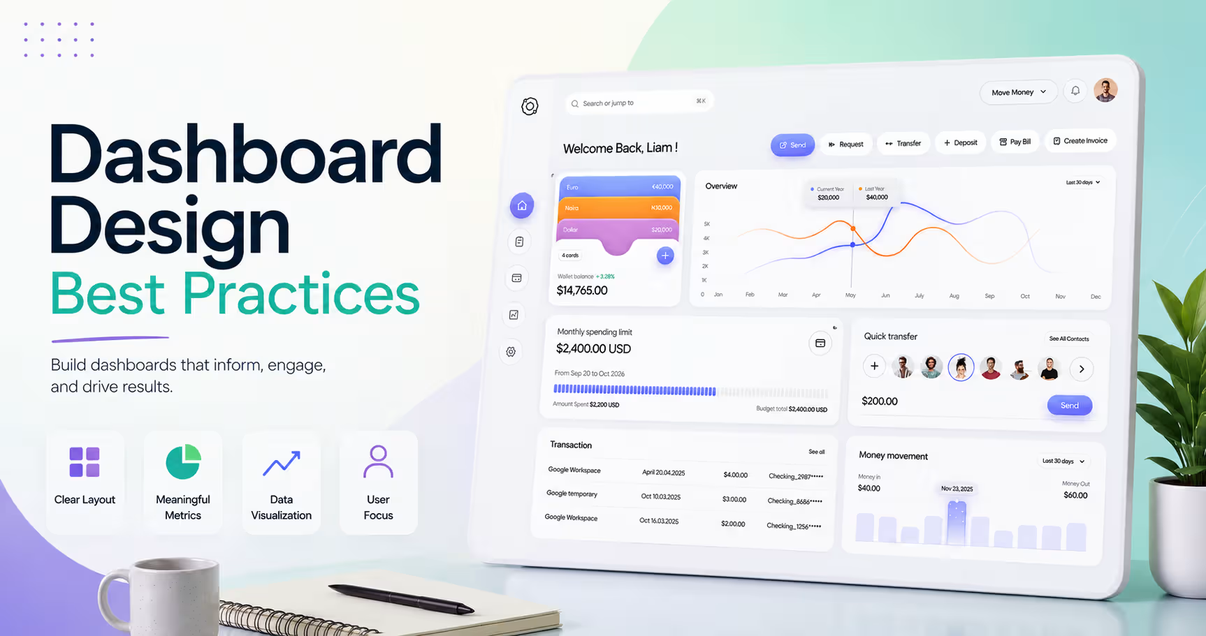
- Great dashboards help users complete tasks - not just view data.
- Prioritize the most important KPIs and actions above the fold.
- Keep layouts simple with consistent spacing, colors, and navigation.
- Build dashboards that work for different users, devices, and accessibility needs.
Think about the last dashboard you used. Could you find the information you needed in just a few seconds? Or did you have to stop, scan the screen, and figure out where to look first?
A great dashboard answers questions before users even have to ask them. It highlights what matters most, removes distractions, and helps people complete their work with confidence.
In this guide, we'll walk through the dashboard design best practices behind clear, user-friendly dashboards. You'll learn proven UX principles, practical layout tips, and see real dashboard examples you can learn from.
What Makes a Great Dashboard Design?
Imagine walking into a well-organized grocery store. The items you need most are easy to find. Signs point you in the right direction. Everything feels familiar, so you spend less time searching and more time getting things done.
A great dashboard works the same way. It doesn't try to show everything at once. Instead, it guides users to the information that matters most. The right KPIs stand out first. Related information stays together. Every chart and button has a clear purpose. Users don't have to stop and figure out where to look next.
The opposite is also true. A dashboard filled with dozens of charts, colorful widgets, and endless metrics doesn't make users smarter. It simply gives them more to process. When everything competes for attention, nothing stands out. Users spend more time searching than making decisions.
Great dashboards usually have a few things in common:
- A clear goal that matches what users want to accomplish
- Important KPIs and actions that stand out first
- A clean layout with related information grouped together
- Consistent colors, spacing, and navigation
- Only the information users need to make decisions
That's why great dashboards start with people, not data. Before choosing charts or building layouts, think about who will use the dashboard and what they need to accomplish.
How to Design a Dashboard
Most dashboard problems don't start with the layout. They start much earlier. They arrange charts, choose colors, and build widgets before they understand who the dashboard is for or what problems it should solve. The result may look polished, but it often feels confusing because it wasn't designed around real user needs.
Great dashboards follow a different process. They start with people, then move to priorities, structure, and finally the interface. By the time visual design begins, every element has a purpose.
Whether you're designing a KPI dashboard, an admin panel, or a SaaS product, following a structured dashboard design process helps create dashboards that are easier to understand, easier to navigate, and easier to use.
Step 1: Understand Your Users
Every dashboard exists to help someone do a job. Before designing anything, understand who those users are and what they're trying to accomplish.
Start by asking simple questions. What decisions do users make every day? What information do they look for first? What problems slow them down? User interviews, user personas, and Jobs to Be Done (JTBD) workshops are great ways to uncover these answers.
Different users also need different information. A CEO wants high-level business performance, while a support manager needs ticket status and response times. Designing around real user goals makes the dashboard feel useful instead of overwhelming.
Step 2: Define What Matters Most
Every dashboard has limited space. That means every chart, KPI, and widget has to earn its place.
Instead of displaying every available metric, focus on the information that helps users make decisions. Start with your most important business metrics or North Star Metric, then add supporting KPIs only when they provide useful context.
A simple rule works well here: If a metric doesn't help users take action, it probably doesn't belong on the dashboard.
That's often the difference between a focused dashboard and one that feels cluttered.
Step 3: Organize Information
Imagine walking into a supermarket where milk is next to shampoo and bread is beside pet food. You'd eventually find what you need, but it would take much longer than it should.
Dashboards work the same way. Before thinking about colors or components, organize related information into logical groups. Build a clear information architecture, keep navigation predictable, and place actions close to the data they affect. Users shouldn't have to search across the screen to complete a simple task.
A well-organized dashboard feels familiar. People naturally know where to look because the layout matches how they think.
Step 4: Create Wireframes
Don't worry about colors too early. Focus on solving the layout first.
Think of a wireframe as the blueprint for your dashboard. Just as an architect plans a building before choosing paint colors, designers should validate the structure before polishing the interface.
Wireframes help teams explore different dashboard layouts, gather feedback early, and spot usability issues before development begins. Fixing problems during wireframing is much faster, and far less expensive than redesigning a finished product.
Step 5: Test and Improve
The first version of a dashboard is rarely the best one.
Watch how people actually use it. Notice where they hesitate, what they ignore, and which actions they take first. Those small moments often reveal the biggest opportunities to improve the experience.
Use usability testing, product analytics, and user feedback to keep refining the dashboard over time. As your product evolves, your dashboard should evolve too.
For example, During the Upmatch project, we tested how recruiters navigated the platform while reviewing candidates and managing hiring tasks. The feedback showed that some key actions took too many clicks and important information wasn't easy to scan.
By reorganizing the layout, grouping related actions together, and improving the visual hierarchy, we created a workflow that felt faster, more intuitive, and easier for recruiters to use.

12 Effective Dashboard Design Best Practices
Great dashboards feel effortless to use because every design decision has a purpose. They reduce confusion, highlight what matters, and help users stay focused on their goals instead of searching through data.
Here, we'll walk through 12 dashboard design best practices that improve usability and create a better user experience.
1. Design Around User Goals, Not Every Metric
People don't open a dashboard to admire charts. They open it because they need answers. Maybe they want to check sales performance, approve a request, or spot a problem before it grows. If they can't do that quickly, the dashboard isn't helping them.
One of the biggest dashboard design mistakes is trying to show everything at once. More metrics don't always create more value. They often create more distractions. A great KPI dashboard focuses on what users need to accomplish, not every piece of data your system can collect.
Start by identifying the user's primary goal. Ask yourself, "What decision should they be able to make within the first few seconds?" Then build the dashboard around that answer. Supporting metrics can always come later, but the most important information should never compete for attention.
A user-focused dashboard should:
- Start with the user's primary task.
- Show only the KPIs that support that task.
- Match information to different user roles.
- Remove widgets that don't help users take action.
If different users need different information, explore our guide on Multi-Tenant Dashboard Design to learn how role-based dashboards create better user experiences.
2. Establish a Clear Visual Hierarchy
Imagine opening a dashboard where every card is the same size, every number is bold, and every color demands attention. Where would you look first? Most people wouldn't know.
A strong visual hierarchy answers that question before users even think about it. It naturally guides their eyes through the interface using typography, spacing, size, contrast, and positioning. Instead of asking users to search, the design quietly points them toward what matters most.
Good dashboards also follow familiar scanning patterns, such as the F-pattern or Z-pattern, making key information easier to find. The goal isn't to make everything stand out. It's to make the right things stand out.
A strong visual hierarchy should:
- Highlight the most important KPIs first.
- Group related information together.
- Create clear separation between sections.
- Use spacing and typography to guide attention.
Want to improve spacing and layout? Read our guide on Bento Grid Dashboard Design to see how structured layouts improve readability.
3. Reduce Cognitive Overload
Showing more information doesn't make a dashboard more useful. It usually makes it harder to use.
People can only process a limited amount of information at one time. When every chart, notification, and widget competes for attention, users slow down because they have to decide what deserves their focus. That's a classic example of cognitive overload.
Instead of placing everything on one screen, reveal information gradually. Progressive disclosure helps users focus on what's important first while keeping advanced details available when they're needed. Combined with principles like Miller's Law and Hick's Law, this approach reduces unnecessary choices and makes dashboards feel faster and easier to navigate.
Reduce cognitive overload by:
- Showing essential information first.
- Grouping related content together.
- Hiding advanced options until users need them.
- Removing duplicate or low-value metrics.
Many cluttered dashboards suffer from the same usability issues. Learn how to avoid them in our guide on SaaS UX Mistakes.
4. Prioritize Important KPIs
Not every metric deserves the top of your dashboard. Think about the front page of a newspaper. The biggest story appears first because it's the one readers need to see immediately. Dashboards should work the same way.
Place your most important KPIs above the fold so users can understand the current situation without scrolling.
Supporting metrics, historical trends, and secondary insights can appear farther down the page or inside expandable sections. This simple change makes dashboards easier to scan and helps users focus on what matters first.
When prioritizing KPIs:
- Place primary metrics above the fold.
- Keep related metrics together.
- Position actions close to the data they affect.
- Update real-time metrics where timely decisions matter.
Looking for inspiration? Explore our B2B SaaS Dashboard Design Examples to see how different products prioritize KPIs based on user goals and business needs.
5. Choose the Right Visualization
Most chart problems don't happen because designers choose the wrong tool. They happen because they ask the wrong question.
Before picking a chart, ask yourself one thing: What story should this data tell?
If users need to compare numbers, bar charts usually work best. If they need to understand how something changes over time, line charts tell that story much more clearly. If you're showing how a few categories contribute to a whole, a simple pie chart can work - but only when there are very few slices.
The goal isn't to use the most attractive chart. It's to make the answer obvious. Think about it this way. If someone has to stop and figure out how to read your chart, you've already lost a few seconds.
Good dashboard tools like Tableau, Power BI, Qlik, Domo, and Klipfolio offer dozens of visualization options. Experienced designers don't use more charts because they can - they use the one that communicates the message with the least effort.
6. Keep Layouts Clean and Consistent
Imagine walking into a hotel where every floor has a different room numbering system. You'd probably spend more time looking for your room than enjoying your stay. Dashboards work the same way.
When every page follows a different layout, users have to learn the interface again and again. But when cards line up, spacing stays consistent, and related information always appears in familiar places, the dashboard becomes predictable. That's exactly what users want.
Good layouts don't attract attention - they disappear. People focus on their work because they aren't busy figuring out the interface.
Simple design habits make a huge difference:
- Keep related information together.
- Follow a consistent grid.
- Reuse the same card styles and spacing.
- Let whitespace separate ideas instead of borders.
- Avoid moving navigation or actions between pages.
That's why dashboard layout best practices focus on consistency before creativity. Our guide on Bento Grid Dashboard Design explains how modular layouts make complex dashboards easier to scan and maintain.
7. Use Color Intentionally
Traffic lights don't work because they're colorful. They work because everyone understands what the colors mean.
Dashboards should follow the same principle. Color isn't decoration. It's communication.
When every widget uses a different accent color, nothing feels important. But when colors have consistent meaning, users understand the interface almost instantly. Green signals success. Red draws attention to problems. Yellow warns about something that needs attention.
The same rule applies to buttons, badges, and notifications. Color should reinforce meaning - not create it.
That also means thinking about accessibility. Not everyone sees colors the same way. Important information should always be supported by labels, icons, or patterns, while good contrast ensures text remains readable in every situation.
Instead of asking, "Which colors look good together?" Ask, "Will users understand this dashboard even if the colors disappeared?" That's usually the better design question.
8. Design for Different User Roles
Imagine giving your CEO the exact same dashboard your customer support team uses. The CEO would spend time looking at ticket queues and response times. Now give the support team the CEO dashboard.
They'd see revenue charts and business forecasts while struggling to find the information they actually need. Neither dashboard is wrong. They're simply built for the wrong person.
That's why the best products use role-based dashboards. Every user should see the information that helps them do their job, while everything else stays in the background.
This doesn't just improve usability. It also keeps products more secure by limiting access through the right permissions.
As SaaS products grow, personalized experiences become even more important. A multi-purpose SaaS design may support hundreds of companies, but each customer - and each role inside that company - expects a design that feels built for them.
9. Design Responsive Dashboards
Imagine checking your dashboard on your laptop before leaving the office. Later that day, you open the same dashboard on your phone while commuting. You shouldn't feel like you're using a completely different product.
That's the goal of responsive dashboard design. Many teams think responsive design means shrinking everything to fit a smaller screen. It doesn't. It means deciding what users need most on each device and adapting the layout without changing the experience.
On a desktop, users have room to compare charts, tables, and multiple data points at once. On a mobile dashboard, they usually need quick answers and simple actions. The most important KPIs should stay visible, while secondary information can move into expandable sections or separate screens.
The experience should feel familiar, even if the layout changes. Users shouldn't have to relearn where information lives every time they switch devices.
10. Remove Unnecessary Clutter
Think about your desk. If every document you've touched over the last six months is still sitting on it, finding today's work becomes much harder. The information is there - but it's buried under everything else.
Dashboards work the same way. One of the simplest ideas in dashboard design comes from Edward Tufte, who introduced the concept of the data-ink ratio. In simple terms, every visual element should help users understand the data. If it doesn't, it probably doesn't need to be there.
That doesn't mean dashboards should look empty. It means every chart, border, icon, and label should have a purpose. Removing visual noise often improves usability more than adding another feature.
Instead of asking, "What else can we add?" Ask, "What can we remove without losing value?"
The cleaner the dashboard feels, the easier it becomes to understand. Simplicity isn't about showing less data. It's about making the right data easier to find.
11. Design for Accessibility
Not everyone experiences your dashboard the same way. Some users can't clearly tell the difference between red and green. Others navigate entirely with a keyboard instead of a mouse. For someone with low vision, poor contrast can make important information almost impossible to read.
Good accessibility starts by thinking about those users from the beginning - not as an afterthought.
Following WCAG 2.1 guidelines helps create dashboards that more people can use with confidence. That includes using sufficient contrast, supporting keyboard navigation, writing clear labels, and making sure important information isn't communicated through color alone.
A simple way to think about accessibility is this: If someone uses your dashboard differently than you do, can they still complete the same tasks? If the answer is yes, you're moving in the right direction.
Accessibility isn't only about compliance. It's about creating better experiences for everyone. Higher contrast improves readability outdoors. Larger click targets help mobile users. Clear labels reduce confusion for first-time users. Inclusive design usually benefits all users, not just a small group.
Our guide on Accessibility in UI/UX Design explores practical ways to build more inclusive digital products without sacrificing usability.
12. Your Dashboard Is Never Finished
Launching your dashboard isn't the finish line. It's the beginning of learning how people actually use it. Users will always surprise you.
They may ignore a chart you thought was important, click somewhere you never expected, or spend extra time searching for information you believed was obvious. Those moments aren't failures - they're valuable feedback.
Watch how people interact with the dashboard. Review analytics, observe UX testing sessions, and listen to customer feedback. Small patterns often reveal the biggest opportunities for dashboard optimization.
For example:
- If users repeatedly open the same report, maybe that information belongs on the dashboard.
- If an important widget is rarely used, ask whether it's difficult to find or simply unnecessary.
- If users keep asking the same questions, the dashboard may not be providing the answers clearly enough.
Real Dashboard Design Examples from Orbix Studio
The best way to understand dashboard design is by seeing it in action. Here are 6 real dashboard examples that show how following SaaS UI UX design principles can create clear, user-friendly dashboards.
Analytics Dashboard
https://dribbble.com/shots/27538982-Trade-Analytics-Dashboard-Design
Analytics dashboards often contain dozens of metrics, but users rarely need to study every number at once. This dashboard solves that problem by placing the most important KPIs at the top, followed by supporting charts and detailed insights below.
The consistent card layout, balanced spacing, and simple chart selection make it easy to understand performance within seconds without feeling overwhelmed.
Key takeaway: Prioritize important KPIs first, group related information together, and use visual hierarchy to guide users naturally through the dashboard.
Finance Dashboard
https://dribbble.com/shots/27019826-NobleFinance-Financial-Dashboard-UI-Management-Platform
Financial products typically display large amounts of information, including transactions, balances, spending trends, and account activity.
Instead of trying to show everything equally, this dashboard organizes data into clear sections with reusable cards, meaningful charts, and generous whitespace. Users can quickly check their financial health while exploring more detailed information only when needed.
Key takeaway: Organize complex information into manageable sections and let layout - not decoration - create clarity.
Project Management Dashboard
https://dribbble.com/shots/26776961-Project-Management-Dashboard-Milestones-Timeline-View
A project dashboard should help teams stay organized and take action, not just monitor progress.
This Kanban dashboard keeps projects easy to manage by grouping tasks into clear workflow stages, making priorities visible, and keeping actions close to the information users need.
The layout reduces unnecessary clicks and helps teams understand project status at a glance.
Key takeaway: Build dashboards around user workflows so people can manage work without constantly switching between screens.
CRM Dashboard
https://dribbble.com/shots/27196732-Winx-Customer-Management-Dashboard-Design
CRM dashboards bring together customer information, tasks, team activity, and business performance in one place.
This example uses a clean layout, searchable data, and clear navigation to help users move quickly between customer records and daily activities. Instead of filling every corner with data, the interface focuses on helping users complete common tasks faster.
Key takeaway: Design dashboards around everyday workflows and surface the actions users perform most often.
Health Care Dashboard
https://dribbble.com/shots/26930674-Healthcare-Analytics-Dashboard-Patient-Monitoring-UI
Healthcare and wellness dashboards often display many different metrics at the same time.
This design keeps the experience approachable by using clear grouping, meaningful colors, and consistent dashboard cards. Important health indicators stand out immediately, while supporting information remains easy to access without competing for attention.
Key takeaway: Even data-heavy dashboards can feel simple when information is grouped logically and visual hierarchy remains consistent.
Mobile Dashboard
https://dribbble.com/shots/26554441-Fitness-and-Health-Monitoring-App
A mobile dashboard isn't a smaller version of a desktop dashboard - it's a simplified one. This design focuses on the most important KPIs, larger touch targets, and a clean single-column layout that works comfortably on smaller screens.
By removing unnecessary elements and simplifying navigation, users can complete important tasks quickly, wherever they are.
Key takeaway: Responsive dashboards should preserve the user experience by prioritizing essential information instead of trying to display everything on a smaller screen.
Dashboard Design Checklist
Before you launch a new dashboard or redesign an existing one, take a few minutes to review the fundamentals. This dashboard design checklist summarizes the key principles covered throughout this guide and can help you perform a quick dashboard review before your product goes live.
- ☐ Start with one clear user goal: Design every dashboard around a specific task or decision instead of trying to show everything at once.
- Prioritize the right KPIs: Place the most important metrics above the fold and move supporting data into secondary sections.
- Create a strong visual hierarchy: Use size, spacing, contrast, and positioning to naturally guide attention toward the most important information.
- Keep the interface free from clutter: Remove duplicate charts, unnecessary widgets, and decorative elements that don't help users take action.
- Choose the right chart for the data: Match each visualization to the story you're telling, whether it's comparing values, showing trends, or tracking progress.
- Follow a consistent layout: Use predictable grids, spacing, alignment, and reusable UI components across the entire dashboard.
- Design for every screen size: Adapt the layout for desktop, tablet, and mobile without changing the overall user experience.
- Use colors with purpose: Keep colors consistent, maintain good contrast, and use status colors to communicate meaning instead of decoration.
- Personalize dashboards for different users: Show relevant information based on user roles, permissions, and responsibilities.
- Keep improving after launch: Use user feedback, analytics, and usability testing to refine the dashboard over time.
Frequently Asked Questions
What are the key principles of good dashboard design?
Good dashboard design focuses on user goals, not just data. Prioritize important KPIs, create a clear visual hierarchy, keep layouts simple and consistent, choose the right charts, design for accessibility, and continuously improve the dashboard based on user feedback.
What are the key principles of good dashboard design?
There's no fixed number, but most dashboards should display only the metrics users need to make decisions. Focus on a handful of meaningful KPIs and move secondary data into reports or expandable sections to avoid overwhelming users.
What is the five-second rule in dashboard design?
The five-second rule means users should understand a dashboard's purpose and identify the most important information within a few seconds. A clear visual hierarchy helps users know where to look first without confusion.
What chart types should you avoid in a dashboard?
Avoid chart types that make data harder to understand, such as 3D charts, oversized pie charts with many categories, and overly decorative graphics. Choose visualizations that communicate information clearly and support quick decision-making.
What's the difference between a dashboard and a report?
A dashboard provides a real-time overview of key metrics to support everyday decisions. A report offers detailed historical data and deeper analysis, making it better for reviewing performance and identifying long-term trends.
How do you design dashboards for different user roles?
Design role-based dashboards that show relevant KPIs, actions, and permissions for each user. Personalizing the experience reduces clutter, improves usability, and helps users find the information they need faster. Learn more in our Multi-Tenant Dashboard Design guide.
How much does professional dashboard design cost?
Dashboard design costs depend on complexity, user roles, integrations, responsiveness, and customization. A simple dashboard costs much less than a feature-rich SaaS dashboard with advanced analytics and role-based experiences. See our SaaS dashboard design cost guide for a detailed breakdown.
Wrapping Up
Building a great dashboard isn't about following trends or adding more features. It's about understanding your users, organizing information clearly, and making every design decision serve a purpose. Small improvements, applied consistently, often create the biggest impact.
Use the principles in this guide as a starting point, then continue learning from real user behavior. As your product grows and user needs change, your dashboard should evolve with them, creating a better experience every step of the way.
.avif)




















.png)
