- What Most Founders Get Wrong About Mobile App Redesign
- Full Redesign vs App Refresh: Which One Do You Need?
- What a Good Mobile App Redesign Actually Looks Like
- The Mobile App Redesign Process: Step by Step
- How Orbix Studio Approaches Mobile App Redesign
- Red Flags to Avoid Before You Start
- Frequently Asked Questions
- Conclusion


.svg)

%201%201.svg)
Mobile App Redesign: A Step-by-Step Process Guide 2026

- A mobile app redesign is a full overhaul of your app's UX, UI, or both to fix user drop-off, broken flows, or low retention.
- Audit before you design: start with user data and session behavior, not aesthetics.
- Most redesigns fail because founders skip the discovery phase and jump straight to building new screens.
Mobile app redesigns start from the wrong place. A founder sees poor app store reviews, a drop in daily active users, or a competitor with a cleaner interface, and immediately asks a designer to "make it look better." Six months and $40,000 later, the new version ships. User retention stays flat. Churn goes up. The interface looks different, but the core problems are still there.
Redesigning a mobile app is not a visual exercise. A true mobile app redesign touches your user flows, information architecture, interaction patterns, and feature hierarchy, in addition to the UI layer. Get the sequence wrong and you'll rebuild the same problems into a newer interface.
This guide gives you the exact process for planning and running a mobile app redesign, including when to do it, what to fix first, how much to budget, and the questions to ask before any work begins. By the end, you'll have a decision framework that tells you what to do first, not just a checklist of steps.
What Most Founders Get Wrong About Mobile App Redesign
A mobile app redesign fixes broken user flows, not just broken visuals. Most founders confuse a redesign with a visual refresh, rebuild their navigation first, and leave the same failed activation sequence intact under a new color system. That's the mistake that turns a three-month project into a six-month rebuild.
Here's why it happens: visual problems are easy to see. A misaligned button, an outdated icon set, an inconsistent color palette. These are visible, photographable, shareable in a Figma screenshot. But user drop-off at step three of a seven-step activation flow? That requires reading session analytics, interviewing churned users, and mapping screen recordings. Most teams skip that research phase because it doesn't feel like design work.
Airbnb ran into this in 2014. Their original app interface wasn't aesthetically broken. What was broken was the host and guest flows living inside on the same navigation architecture with no clear separation. When they rebuilt, because redesign wasn't about typography. It was about splitting user journeys structurally. The visual overhaul came after the structural decisions were locked.
Skipping discovery doesn't save time. Rebuilt interfaces with the same structural problems still fail the same users. Now that you know where most redesigns break down, here's exactly how to decide what kind of redesign your app actually needs.
Full Redesign vs App Refresh: Which One Do You Need?

A full mobile app redesign rebuilds your user flows, information architecture, and UI from the ground up. An app refresh updates the visual layer, such as colors, typography, icons, and spacing, without changing how users navigate or interact with the product. Choosing the wrong track wastes budget and delays the outcome you actually need.
Getting that call right from the start is usually why founders bring in UI/UX design help early, instead of guessing and re-scoping halfway through.
When a Full Redesign Is Right
Go full redesign when:
Users drop before reaching the core feature. If users leave during the initial activation flow or can't reach the primary action in three taps, the navigation structure is broken, not the visuals.
App store reviews mention confusion, not bugs. Complaints that say "I can't find where to..." or "Nothing makes sense" signal a structural failure that a new color palette won't fix.
Your app was built on a 2019 architecture and features have been layered in since. Feature layering without restructuring creates dead ends, orphaned screens, and navigation patterns that contradict each other. Users feel this even when they can't name it.
When an App Refresh Is Enough
Stick to a refresh when:
- Users complete key flows without friction, but the UI looks outdated next to newer competitors
- Your app store rating is 4.2 or higher, but download growth has slowed
- Core navigation is intuitive, but design tokens, typography, and spacing are inconsistent across screens
Apps that have been live for three or more years need a redesign, not a refresh. Refresh logic applies to products with clean structural foundations built in the last 18 months. Check your current experience against established mobile app UX best practices before deciding. The gap between what you have and what a well-structured app delivers tells you which track to take.
What a Good Mobile App Redesign Actually Looks Like
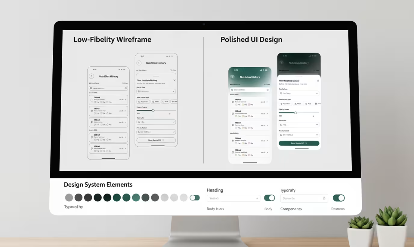
A successful mobile app redesign produces measurable improvements in three areas: user retention, feature adoption, and time-to-first-value. Not "it looks better," but "users who used to drop at step two now complete activation at 74%."
Spotify has run several redesign cycles on its mobile app. Each cycle focused on a specific friction point, not a full visual overhaul. In one update cycle, they restructured the home feed to reduce the number of taps required to reach a recently played track from three to one. Session length increased in the following quarter. The visual change was secondary and structural change was the lever.
Good redesign outcomes are concrete and defined before the first wireframe gets drawn:
- Time-to-first-value drops below 60 seconds for new users
- Core feature is reachable in three taps or fewer from the home screen
- App store rating improves by at least 0.3 points within 90 days of launch
- 30-day retention increases from the pre-redesign baseline by a defined percentage
Setting these benchmarks before design starts keeps the team aligned on what "done" means. Without them, every design decision becomes subjective and timelines drift. Here's the exact sequence to get from current state to those benchmarks.
The Mobile App Redesign Process: Step by Step

A mobile app redesign follows a fixed sequence: audit, define, design, test, launch, and measure. Skipping any step doesn't shorten the timeline. It moves the problem later in the process, where fixing it costs significantly more.
Step 1: UX Audit
Start with data before mockups. Pull your session recordings, funnel analytics, and app store reviews. Find where users drop, what they tap that doesn't respond, and which flows they abandon before completing. Mixpanel and FullStory both surface these patterns within hours of connecting to a live product.
When Orbix Studio runs a UX audit for a mobile app, the first output is a friction map: every screen where users stop, hesitate, or leave. That map drives the redesign brief, not assumptions about what the UI should look like.
Step 2: User Research
Run five to eight interviews with churned users and active users. Churned users tell you what broke the relationship. Active users tell you what to protect during the redesign. According to Nielsen Norman Group, five usability tests with representative users catch 85% of major usability problems. You don't need 50 interviews to know where your app fails.
Step 3: Information Architecture
Rebuild your navigation structure before opening Figma. Map every screen, every user action, and every flow. Identify orphaned screens, dead ends, and feature duplication. A flat architecture with five or fewer top-level navigation items reduces time-to-action in most mobile use cases. For a complete walkthrough of this phase and how it connects to build decisions, see the mobile app development guide.
Step 4: Wireframing and Flow Design
Build low-fidelity wireframes for every redesigned flow before moving to high-fidelity screens. Wireframes are fast and cheap to change. High-fidelity screens are not. Every structural decision should be locked at the wireframe stage, with explicit sign-off before visual design begins.
Step 5: High-Fidelity UI Design
Apply the visual layer after the structure is approved. Build a design system with reusable components including tokens for color, typography, spacing, and interactive states. Figma's component system lets teams push updates to every screen from a single component edit, which cuts implementation time and reduces design inconsistency across the product. For the full scope of how this connects to your UI/UX design foundation, that page covers the broader methodology.
Step 6: Usability Testing
Test with real users on real devices before handing off to development. Run five sessions at minimum. Focus on the critical flows: the initial activation sequence, core feature access, and account-level actions. Fix what breaks before handoff. Bugs found in testing cost a fraction of bugs found in production.
Step 7: Development Handoff
Deliver Figma files with annotated specs, interaction notes, and a complete component library. Developers who receive incomplete handoff packages rebuild design decisions independently. Every gap in the handoff creates variation between the designed product and the shipped product. For a clear view of what development costs after a redesign is approved, the mobile app development cost guide breaks down typical figures by scope and platform.
Step 8: Launch and Measure
Ship to a subset of users first when possible. Measure the benchmarks defined before design started: retention, feature reach, time-to-first-value, and app store rating. Give the new version 60 days of data before drawing conclusions. Decisions made in 14 days are almost always premature.
How Orbix Studio Approaches Mobile App Redesign
Orbix Studio's mobile app redesign process starts with a 90-minute audit call, not a proposal deck. Before any design work begins, the team reviews the client's analytics, session recordings, and app store feedback to identify the three highest-impact friction points in the existing experience.
From there, Orbix produces a friction map and a redesign scope document within five business days. That document defines what will change, what won't, why each decision was made, and what success looks like in measurable terms. No redesign work starts until the scope is agreed upon by both sides.
One B2B project management app with around 8,000 active users came to Orbix after 30-day retention dropped from 62% to 41% over six months. Review analysis showed new users couldn't reach the core task creation flow within their first session. Orbix restructured the initial activation sequence from seven steps to three, moved the primary action to the home screen, and rebuilt the navigation from a five-tab model to a two-tab model with an action sheet. Sixty days after launch, 30-day retention recovered to 58%.
Founders weighing in-house redesign against working with a specialist team often find the decision comes down to speed and expertise, not cost. For a direct comparison of both approaches and when each makes sense, the SaaS UX redesign for conversions guide covers the criteria in detail.
Want to see how Orbix approaches your specific redesign challenge? Book a free redesign call ->
Red Flags to Avoid Before You Start
Starting a mobile app redesign without asking the right questions upfront turns a focused six-week project into a six-month rebuild. Three specific red flags tell you a redesign is being set up to fail before a single wireframe gets drawn.
Red Flag 1: No baseline metrics exist
If you can't answer "what is our current 30-day retention rate?" before the redesign starts, you can't measure whether the redesign worked. Good answer: "Our 30-day retention sits at 34% and we want to reach 50%." Red flag answer: "Users seem to like it but we're not sure about the numbers."
Red Flag 2: Design work starts before research
Any team that asks for brand assets and content before reviewing your analytics is designing for aesthetics, not outcomes. Good answer: "We'll need access to your session recordings and funnel data in week one." Red flag answer: "Send us your brand guidelines and we'll start on wireframes."
Red Flag 3: Success is defined by visuals, not metrics
"Better UX" is not a success criterion. "New users reach the core feature in two taps or fewer" is. If the team can't define what success looks like in a measurable user action or number, the project will drift and the client will be left judging by how it looks, not whether it works.
Budget context matters before you commit. A mobile app redesign in the USA typically ranges from $15,000 for a focused single-flow redesign to $80,000 or more for a full multi-screen, multi-platform overhaul with research, testing, and design system creation. Comparable cost structures across digital products are covered in our website redesign cost guide.
And if your app's structural problems run deep enough that a redesign would cost more than rebuilding, our mobile app development page explains the signals that point toward a new build instead of a redesign.
Frequently Asked Questions
What is a mobile app redesign?
A mobile app redesign is a structured overhaul of an app's user experience, interface, or both, aimed at fixing specific problems like low retention, poor activation completion, or broken navigation. Redesigns range from flow-level restructuring to full visual rebuilds, depending on where users are actually dropping and why.
How long does a mobile app redesign take?
A mobile app redesign for a mid-sized product with 30 to 80 screens typically takes 8 to 16 weeks from audit to development handoff. Single-flow redesigns with clean existing architecture can finish in 6 weeks. Complex multi-platform redesigns with full research phases run 20 weeks or longer depending on scope and approval speed.
What's the difference between a mobile app redesign and a refresh?
A redesign changes the structure of your app including navigation, user flows, and information architecture. A refresh updates the visual layer only: colors, typography, icons, and spacing. Refreshes are faster and cheaper. Redesigns solve deeper retention and activation problems. Choose based on where users drop, not on how the interface looks.
How do I know if my mobile app needs a redesign?
Your app needs a redesign if users drop before reaching the core feature, if reviews mention confusion rather than bugs, or if 30-day retention sits below 30% for a utility product. Session recordings that show repeated taps on non-interactive elements confirm a structural problem that a visual update won't resolve.
What does a mobile app redesign cost in the USA?
Mobile app redesign cost in the USA ranges from $15,000 for a focused single-flow redesign to $80,000 or more for a full multi-screen, multi-platform overhaul with user research, usability testing, and design system creation. Scope, number of screens, platform count, and team structure are the four main cost drivers.
Can Orbix Studio redesign my existing mobile app?
Orbix Studio redesigns mobile apps for product companies and startups. Every project starts with a UX audit that identifies specific friction points before any design work begins. Orbix covers research, information architecture, UI design, and developer handoff. Projects typically run 8 to 14 weeks depending on scope and platform complexity.
When should I hire a design agency instead of redesigning in-house?
Hire a design agency when your team lacks mobile UX experience, when you need the redesign completed faster than internal capacity allows, or when a previous in-house attempt failed to improve retention. Agencies with a defined audit-first process reduce rework because they identify structural problems before building new screens.
Conclusion
A mobile app redesign that starts with data delivers results. One that starts with aesthetics delivers a new set of the same problems in a cleaner wrapper.
Before briefing any designer or agency, run a basic audit on your own: pull your drop-off data by screen, read your last 50 app store reviews, and define what success looks like in measurable terms. That homework cuts your redesign timeline in half and prevents rebuilding the same friction points into a newer interface.
Ready to make the right decision for your product?Book a free strategy call ->







.svg)
.svg)


.svg)







.avif)



.svg)

