


- The Mistake That Makes This Decision Hard
- Real Signs It's Time for a SaaS Product Redesign
- What a SaaS Redesign Actually Costs and How Long It Takes in 2026
- When a Redesign Is the Wrong Call
- How to Redesign a SaaS Product Without Losing Users
- In-House, Freelancer, or Agency: Who Should Run Your Redesign
- How Orbix Studio Approaches a SaaS Product Redesign
- How to Know the Redesign Is Working (Or Isn't)
- Frequently Asked Questions
- Conclusion


.svg)


%201%201.svg)
SaaS Product Redesign: Know When It Is Time and How to Do It Right
- A SaaS product redesign earns its budget when data shows users are stuck, not when the interface feels old.
- Ship the change in phases, not all at once, and existing users stay.
- Founders confuse "outdated" with "broken," and that mix-up is the costliest redesign mistake there is.
"Is my SaaS product due for a redesign?" That question shows up after a board meeting. Or a competitor launch. Or a screenshot of someone else's shiny new dashboard.
The honest answer rarely has anything to do with how the product looks. A SaaS product redesign earns its budget when the data shows users are stuck. Not when the interface feels dated.
Confuse those two triggers, and you will spend months rebuilding screens. Meanwhile the real problem, a broken activation flow or a confusing pricing page, sits untouched. That confusion costs real money, and it costs even more time your team could spend fixing what's actually driving churn.
This guide covers the real signs it's time to redesign. It also covers what the work costs in 2026 and how long it takes. Then it covers how to change the product without losing the people who already rely on it, and who should run the project.
By the end, you will have a filter you can apply to your own product this week. No guesswork, no vague agency talk, just the checkpoints that actually separate a good redesign from an expensive mistake.
The Mistake That Makes This Decision Hard
The biggest redesign mistake is treating "outdated" and "broken" as the same problem. They are not. A product can look dated and still convert well. A product can also look modern and still lose half its trial users at onboarding.
A common pattern shows up across SaaS teams. They rebuild the interface around a trendier component library, then find that trial-to-paid conversion does not move. Session recordings usually reveal the real issue: users hunting for one number, like account balance or usage limit, buried under three tabs. The buttons were never the problem.
A redesign fixes what's broken. It rarely fixes what's just old.
That mix-up tops the SaaS UX mistakes list for a reason. It explains why a fair share of redesign budgets get spent solving the wrong problem
Rebranding adds to the confusion. A new logo or color palette is not the same project as a redesign, even though the two often get bundled into one budget line. Keep them separate, and the redesign stays focused on what actually breaks for users.
So if looks are not the trigger, what is? Here are the signals worth trusting, and the ones worth ignoring.
Real Signs It's Time for a SaaS Product Redesign
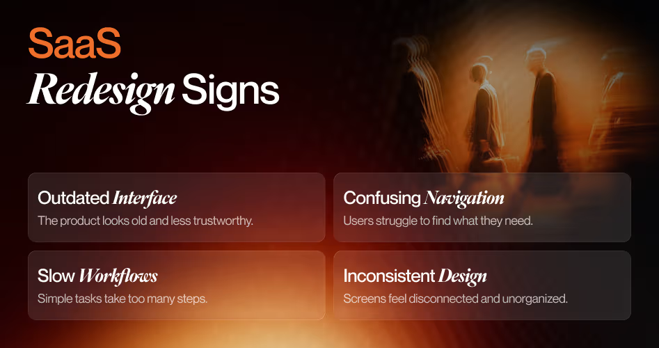
The real signs a SaaS product needs a redesign show up in behavior, not opinions. Stalling activation, rising support tickets for basic tasks, and features nobody adopts all point the same direction. A founder who waits for a customer to say the interface feels old is reading the signal a year too late.
Product Metrics That Signal a Redesign
Feature adoption under 10 percent means users are ignoring tools your team spent months building. That number rarely fixes itself with a new feature announcement.
Retention and activation that stay flat despite new releases point to a product that has grown heavier without getting easier to use. Growth added weight. Design never caught up.
Compare your funnel against B2B SaaS conversion benchmarks before deciding a number is bad. A 4 percent trial-to-paid rate is strong for a self-serve tool with no sales team. That same number is weak for a product with a sales-assisted motion. Context decides whether a metric is actually a problem.
Workarounds are the clearest tell of all. Users build spreadsheets to patch a missing feature, or export data just to read it elsewhere. At that point, the product itself has already lost the job.
User Behavior Signals
Growing friction shows up first in support tickets. Users start asking the same question about "basic" actions. That usually means the product structure no longer matches how people actually work inside it.
Stripe's dashboard has kept its billing summary in the same spot through years of visual updates. That is the one screen every finance team checks first. The pattern is worth copying: change everything except the screen users check daily.
Support tickets that repeat the same question are a redesign brief writing itself.
None of this needs expensive tooling to catch early. A weekly look at support ticket tags and a basic funnel report surfaces these signals well before churn shows up in a billing report.
Churn tied to the first session is rarely a pricing problem. Strategies for reducing churn with UX usually start by fixing this exact friction first, before touching anything else in the product.
Once the signs line up, founders ask the practical question next. What does this actually cost, and how long will it take?
Which Funnel Stage Is Actually Broken
SaaS conversion breaks in four predictable places. Finding which one applies to your product decides where the redesign starts, and how much of the product it needs to touch.
Visitor to signup. Below 3% means the marketing site or the signup form is the problem, not the product. Usually too many fields, or a value proposition that doesn't land above the fold.
Signup to activation. Activation means a user finished a core task and felt the product work. Below 30% means onboarding isn't getting people to that moment fast enough. OpenView Partners found users who activate in their first session convert at four times the rate of those who don't.
Trial to be paid. Below 10% means users aren't seeing enough value during the trial, or the upgrade path adds friction at the exact moment they decide to pay.
Paid to retained. Churn above 5% monthly is a feature discovery and navigation problem more often than a pricing one.
Read the table top down and stop at the first row where you land in the left column. That row is where the redesign starts, even if a later stage looks worse. Check the numbers against B2B SaaS conversion benchmarks for your motion before deciding a figure is bad, since a self-serve tool and a sales-assisted one read the same number differently.
Fixing trial-to-paid while activation leaks is patching the middle of a bucket with a hole in the bottom.
What a SaaS Redesign Actually Costs and How Long It Takes in 2026

A SaaS product redesign costs between $15,000 and $150,000 or more. The range depends entirely on scope. A single flow refresh sits at the low end.
A full overhaul with a new design system sits at the high end. That range holds whether you hire an agency or staff the work internally.
These figures track with Line & Dot Studio's 2026 cost analysis. Budgets scale with how many flows the redesign touches. They do not scale with the size of the company paying for it. Existing design debt pushes the number up too, since a messy component library takes longer to rebuild than a clean one.
Tip: Multiply your monthly churn rate by average contract value before you approve a budget. That number often makes the mid-tier option look cheap by comparison.
Timeline by Redesign Scope
A focused sprint on one flow, like signup or onboarding, typically runs 4 to 8 weeks from research to launch. A full redesign covering navigation, onboarding, and core workflows usually takes 12 to 20 weeks. Add extra time if the redesign also needs a new design system, since that work happens once and pays off on every screen after.
For pricing that scales with business size instead of product scope, the website redesign cost guide covers that side of the budget question.
The number that matters is not the sticker price. It's the cost of leaving a leaking flow unfixed for another quarter.
Budget and timeline are settled. The harder part is making the change without losing the users already inside the product.
When a Redesign Is the Wrong Call
Knowing when not to redesign saves more money than knowing how to run one. Below roughly 200 monthly active users, there isn't enough behavioral data to redesign from. At that size you'd be redesigning around opinions, and opinions are cheaper to test with a conversation than with a project.
Four checks before you approve the budget:
Do you know your current activation rate? If you can't answer within five percentage points, you can't prove the redesign worked either. Add tracking first, then redesign. That order costs a week and saves a quarter.
Have you watched 30 session recordings? Real behavior contradicts team assumptions more often than not. Recordings surface friction that funnel analytics only hint at, and they cost nothing but an afternoon.
What is the one metric you're moving? "Better UX" has no success criteria. "Trial-to-paid from 9% to 18% in 90 days" does, and it also tells you which flow to touch.
Can your team ship the designs within four weeks? Designs that sit in a backlog for three months get built out of context and lose the thinking behind them.
There's a fifth situation worth naming. If a competitor is shipping weekly, a three-month redesign can cost more ground than it gains in conversion lift. A focused four-week sprint on the activation flow usually returns more in that scenario.
A redesign you can't measure is a rebrand with a bigger invoice.
If those four checks pass, the budget is justified. The harder part is making the change without losing the users already inside the product.
How to Redesign a SaaS Product Without Losing Users
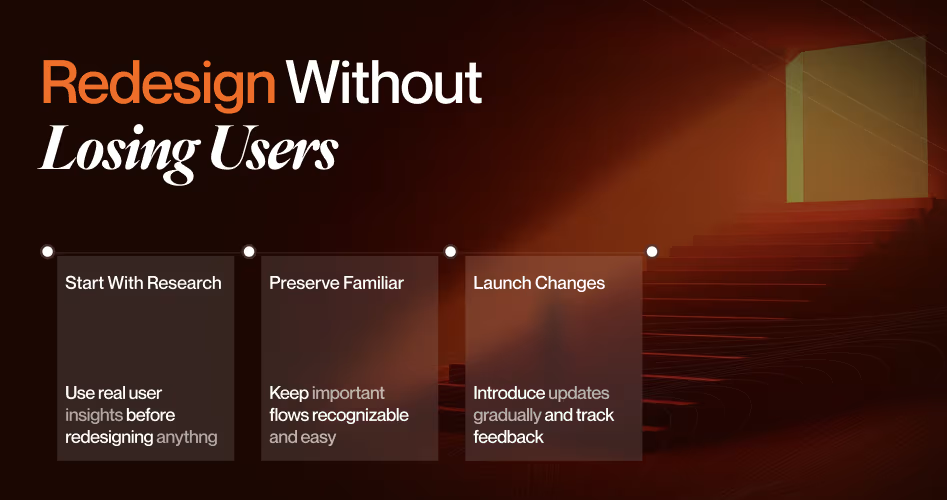
You redesign a SaaS product without losing users by changing the experience in stages. Test each stage with a small group first. Keep familiar patterns wherever they still work. The safest redesign is the one users barely notice happening.
Start With Research, Not Visuals
Funnel data and session recordings should shape the brief before a single wireframe gets drawn. This is a different exercise than market research, which tells you what to build next. Product research tells you what's already broken in what you shipped.
Test the direction with a clickable prototype before anything reaches production. The gap between a wireframe, a mockup, and a prototype matters here. A prototype is the only one of the three you should put in front of real users.
Fix the Patterns, Not the Screens
Research usually lands on the same short list of culprits. These are the interface patterns that cost the most conversions across SaaS products, and none of them require a full rebuild to fix.
Empty states deserve extra attention because they're the cheapest fix on the list and the earliest in the funnel. Stripe's new accounts see a demo transaction, so the first screen shows what working looks like instead of what missing looks like. The SaaS dashboard design guide covers how to structure that first screen once data starts arriving.
Fix the onboarding copy at the same time. A new interface paired with an old customer onboarding checklist confuses returning users faster than the redesign does on its own.
One bad pattern costs a user a minute. Four in sequence cost you the user.
Roll Out in Phases, Not All at Once
Linear ships interface changes to a subset of workspaces before a full release. That is why long-time users rarely report the jarring redesign backlash that smaller tools tend to see.
Pick the highest-friction flow first. Release the fix to a small segment, then watch completion rates before expanding further. Each phase becomes a feedback loop instead of a gamble.
Run the new flow alongside the old one for a stretch, if your traffic allows it. Watch completion rate and time on task side by side, not just whether people say they like the change.
Communicate the Change Before Users Feel It
Update your customer onboarding checklist alongside the redesign itself. A new interface paired with old onboarding copy confuses returning users faster than the redesign ever could on its own.
Tell people what is changing and why, before they hit the change cold. Jakob Nielsen's research on aggressive redesigns found that even a better interface still costs users the time it takes to relearn it. That cost is worth naming up front, not discovering in a support queue.
Users don't resist change because it's worse. They resist it because it slows them down for a week.
Phasing the rollout answers how to change the product safely. It does not answer who should run the project.
In-House, Freelancer, or Agency: Who Should Run Your Redesign
Choose in-house when your founding designer still has time and product context. Choose a freelancer when the scope is one flow with a clear deliverable. Choose an agency when the redesign touches how the whole product feels across every screen.
None of these three options is inherently better than the others. Each one fits a different shape of problem, and the wrong match wastes budget no matter how skilled the people involved are.
When In-House Makes Sense
If the person who shaped the original product is still on the team, and still has room on their plate, use them first. Nobody outside the company knows the product's history that well yet. The full in-house team vs. agency comparison walks through the trade-offs if your team is still weighing this.
When a Freelancer Makes Sense
A single flow, a landing page, or one deliverable with a fixed scope suits a freelancer well. The agency vs. freelancer comparison lays out where that arrangement stops working. It usually breaks down once the project grows past one deliverable.
When an Agency Makes Sense
A redesign that reshapes navigation, onboarding, and the design system at once needs a team holding the whole system in their heads. That scale of work benefits from a group, not one person working alone. SaaS design agency pricing breaks down what different engagement models cost once the scope crosses that line.
Hire for the size of the problem, not the size of the vendor's portfolio.
Whichever route you take, the process behind it matters more than the title on the invoice. Here is what that process looks like in practice.
How Orbix Studio Approaches a SaaS Product Redesign
At Orbix Studio, a redesign engagement starts with a working session on funnel data and support tickets, not a mood board. The team maps the highest-friction flow first. It validates a fix with a small user segment before moving to the next area of the product.
That order puts research first and one flow at a time. It matches the approach in SaaS UX redesign for conversions, which covers the same method in more detail. See how the thinking plays out across other product work in the case studies.
The team also documents every decision in a shared brief. That way support and marketing know what changed, and why, before customers start asking.
A redesign that starts with a flow instead of a mood board is a redesign built to survive contact with real users.
Want a second set of eyes on where your product's redesign should start? See our SaaS design process ->
A redesign built this way still needs a way to prove it worked. Here's what to check after launch.
How to Know the Redesign Is Working (Or Isn't)
A SaaS redesign is working when the metric that triggered it moves. If it launched to fix drop-off, check drop-off. If it launched to fix adoption, check adoption at three points: 30, 60, and 90 days after release. Vanity metrics like page views rarely tell this story, so tie the check back to the exact number that justified the project.
Signs It's Working
Drop-off at the flow you targeted falls, and it keeps falling past the first two weeks of novelty. Support tickets tied to the old friction point taper off. Feature adoption climbs among users who had not touched that part of the product before.
Slack has kept its sidebar structure through several visual overhauls. That is one reason long-time users rarely complain about a Slack redesign the way they do about less careful ones. Familiar structure survives even when the visual layer changes underneath it.
Signs It Isn't (and What to Do Next)
Sometimes the same friction persists 60 days out. Or a new bottleneck appears somewhere else in the product. Either way, the redesign solved the wrong layer of the problem, and that is worth admitting early.
Agree on rollback criteria before launch, not during the argument about whether to roll back. Write down which metric would trigger a reversal and how long you will wait for it to move.
A redesign that moves satisfaction scores but not behavior fixed the wrong thing.
That single decision, made early, saves weeks of debate later. Here's what founders ask before committing to the rest of it.
Frequently Asked Questions
How do you know when it's time to redesign a SaaS product?
It's time when the metrics stall, not when the interface feels old. Watch for flat activation despite new releases, rising support tickets around basic tasks, and feature adoption under 10 percent on tools you already shipped. If none of those apply, the fix probably is not visual at all.
What are the signs a SaaS product needs a redesign?
The clearest signs are behavioral. Users build workarounds instead of using the intended flow, support tickets repeat the same question, and churn concentrates in the first session. Aesthetic complaints matter less than a workflow nobody can finish without help from your support team.
How much does a SaaS product redesign cost?
A single flow or feature redesign runs $15,000 to $35,000. A mid-level UX redesign covering core flows and navigation runs $35,000 to $75,000. A full product overhaul with a new design system typically costs $75,000 to $150,000 or more, depending on scope and team size.
How long does a SaaS product redesign take?
A focused sprint on one flow, like onboarding or signup, takes 4 to 8 weeks from research to launch. A full redesign covering navigation, core workflows, and a design system generally takes 12 to 20 weeks, depending on how many teams are involved.
How do you redesign a SaaS product without losing existing users?
Change the experience in phases, and ship to a small user segment first. Preserve familiar patterns wherever they still work. Communicate what is changing before users hit it, and keep a fallback path open until the new version proves itself with real usage data.
What's the difference between a UI refresh and a full product redesign?
A UI refresh changes colors, typography, and spacing while structure and navigation stay the same. A full product redesign changes flows, information architecture, and sometimes what the product actually does. That carries more risk and needs a phased rollout to protect existing users.
Should you redesign in-house or hire a design agency?
Use in-house if your founding designer still has time and deep product context. Hire a freelancer for one flow with a fixed scope. Bring in an agency once the redesign spans navigation, onboarding, and the design system together, since that scale needs a full team.
Which UI patterns hurt SaaS conversion the most?
Seven patterns account for most trial-stage loss: empty dashboards with no guidance, too many features exposed on day one, upgrade prompts that interrupt a task, onboarding with no progress indicator, dense data before the user has context, desktop-only layouts, and a buried upgrade path. Each one is fixable without a full rebuild.
What should I redesign first, the marketing site or the product?
Redesign the product's activation flow first, unless visitor-to-signup sits below 3%. Marketing improvements send more people into a broken first session. Once activation clears 40%, marketing site work starts returning properly because the product can convert the traffic it receives.
Why do users sign up and never activate?
Because the first session doesn't reach a value moment fast enough. The usual causes are a blank empty state, an onboarding sequence that asks for setup details before showing anything useful, or no obvious next action after login. Most teams fix this by redesigning the first five minutes, not the whole product.
Conclusion
No universal moment says a SaaS product is ready for a redesign. The only real signal is your own data, once it stops explaining itself.
Pull your funnel report this week. Find the one flow with the worst drop-off. That is where a redesign, if you need one, should start.
Ready to make the right call for your product? Book a strategy call with Orbix Studio ->























.avif)
