Table of Contents
- What Top SaaS Websites Have in Common
- The 50 SaaS Websites We Analyzed
- They Answer "Is This For Me?" in the First 5 Seconds
- One Primary CTA in the Hero, Not Three
- Social Proof Built Into the Page, Not Added On Top
- Pricing Pages Designed Around the Decision
- Messaging That Matches What Buyers Are Trying to Do
- A Design System That Makes Every Page Feel Like One Product
- Below the Fold: Earning Every Scroll
- Navigation That Guides, Not Overwhelms
- How to Check Where Your SaaS Website Stands
- Frequently Asked Questions
- Conclusion


- Top SaaS websites share 9 structural patterns, not just polished visuals: clarity above the fold is the single most consistent trait
- Rule: conversion architecture always matters more than visual design style
- The mistake founders make: fixing the design before fixing the message

You open a SaaS website you've never seen before. No context. No prior knowledge. You land cold.
Five seconds pass.
You already know what the product does, who it's for, and which button to press. You didn't read carefully. The page told you before you decided to pay attention.
Now open a second one. Different product, probably more features. You land, scroll looking for what it actually does, scroll back up. Still can't place it. You close the tab.
That gap isn't about budget or branding. It's about structural decisions: the choices beneath the visual layer that determine whether a visitor becomes a trial user or a closed tab.
To find those decisions, we went through 50 of the highest-performing SaaS websites, from Stripe and Linear to Deel and Gong. We weren't reviewing design styles. We were mapping what these products share structurally: what goes above the fold, how they handle the primary CTA, and where social proof lives.
Nine patterns came up across every category, price point, and team size.
Here's what the 50 best SaaS websites have in common, and how to tell whether yours is built the same way.
What Top SaaS Websites Have in Common

The core of what top SaaS websites share isn't visual style. It's conversion architecture: the structural decisions that move a visitor from landing to action without friction.
Nine patterns make up that architecture. They appear across Stripe, Linear, HubSpot, Loom, Webflow, Notion, Intercom, and Figma. They hold steady as web design trends shift, and the SaaS website design guide covers the full decision framework behind how these products are built.
The 50 SaaS Websites We Analyzed
Every insight in this article comes from real websites, not abstraction. Below are all 50 products we analyzed, with the standout structural decision each one gets right on their site.
Across all 50, the same structural logic repeats regardless of product category or company size. The patterns below pull directly from what these websites do.
They Answer "Is This For Me?" in the First 5 Seconds
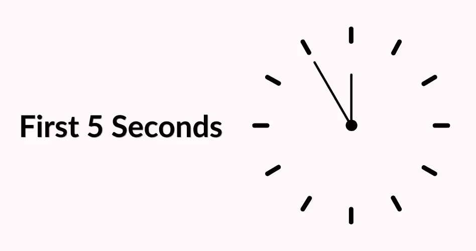
Top SaaS websites solve the visitor's first question before anything else loads: "Is this built for someone like me?" The answer lives in the hero section: the headline, subheading, and CTA. When those three work together, a first-time visitor confirms relevance in under 5 seconds. This is the most consistent pattern across every site in our analysis, and it's examined in detail in the SaaS homepage design guide.
According to research cited by Nielsen Norman Group, users form a first impression of a website in as little as 50 milliseconds. That impression is driven by headline clarity and visual hierarchy, not color palette.
The hero section is not a branding canvas. It's the fastest decision a visitor makes about your product.
Linear's headline: "The issue tracker you'll enjoy using." Seven words. It names the category, implies the problem with existing tools, and promises an outcome. No brand history. Loom does the same: "Record your screen and share it instantly." Eight words, one button below it. The visitor never has to search for what to do next.
The anatomy of a SaaS hero section that converts
Three elements create above-the-fold clarity: a headline naming who the product is for, one supporting line stating the key outcome, and a single CTA with no competing options. Remove any element, or add a second action, and conversion rate drops. Stripe, Linear, and Loom are structurally identical above the fold.
Product screenshots beat generic illustrations
Notion switched from illustrated hero graphics to real product screenshots. The homepage now shows a live workspace view. Figma does the same. Real UI answers the visitor's question. Abstract illustrations raise a new one: "But what does it actually look like?"
One Primary CTA in the Hero, Not Three
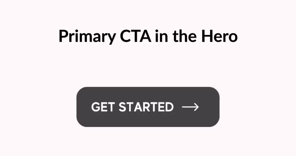
High-converting SaaS websites place one CTA above the fold. Not a "Watch demo" link, a "Start free trial" button, and a "Talk to sales" option competing for the same click. One action, made highly visible, no competing options nearby. This is the clearest friction reduction move in SaaS conversion architecture and why the landing page design best practices guide treats CTA discipline as the first principle.
Stripe shows one button: "Start now." Intercom shows one: "Get a demo." Vercel shows one: "Deploy." All global products with multiple buyer types. All giving every first-time visitor exactly one choice.
Give visitors one decision at a time. Every extra option is friction they didn't ask for.
Multiple CTAs create a micro-decision at the worst moment: when the visitor knows the least. Choice feels like helpfulness. In practice, it creates hesitation.
How to decide which CTA goes first
Match your hero CTA to your dominant buyer intent. For PLG products, that's "Try free" or "Get started." For sales-led B2B, it's "Get a demo" or "Book a call." OpenView Partners' PLG benchmarks show how PLG and sales-led models structure funnels differently from the hero CTA forward. For specific button patterns and CTA copy formulas, the SaaS UI patterns for conversion guide covers each element.
Where secondary CTAs belong
Secondary actions like "See pricing" or "Watch a 2-minute overview" belong below the fold, after the visitor has absorbed the core message. Placing them in the hero creates a decision tree before the visitor has enough context to use it.
Social Proof Built Into the Page, Not Added On Top
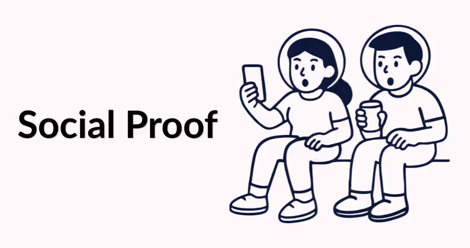
Top SaaS websites treat social proof as infrastructure, not a section. Customer logos, testimonials, and usage numbers appear throughout the page: below the hero CTA, between feature sections, above pricing. The reason is simple: doubt doesn't appear once during a visit. It appears every time a visitor is about to act. SaaS website design examples that convert show this distribution pattern without exception.
HubSpot places its G2 rating directly below the hero CTA. Slack shows a customer logo wall under its headline. Notion puts "Join 30 million+ users" beside the signup button. BrightLocal's Consumer Review Survey found that 79% of consumers trust online reviews as much as personal recommendations, which is why third-party ratings carry so much weight right after the ask.
Social proof works best when it appears exactly where doubt appears.
Where to place social proof for maximum impact
Three positions convert best: below the hero CTA, between feature sections, and above pricing. Each maps to a moment of doubt. For the data behind proof placement, the B2B SaaS conversion rate benchmarks guide shows the numbers.
Pricing Pages Designed Around the Decision
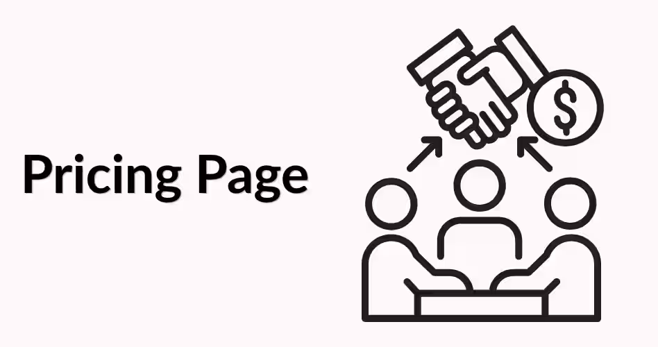
Top SaaS pricing pages reduce friction at the moment a visitor decides whether to buy. Three plan tiers, one highlighted as "Recommended" or "Most Popular," a clear feature comparison, and the annual-versus-monthly question answered directly on the page. A pricing page that tries to document every feature loses the visitor who just wants to know what to pay.
Stripe shows three plans with the top tier highlighted in a distinct color. HubSpot follows the same structure. Linear shows Free, Pro, and Enterprise with Pro emphasized. Three plans map directly to how buyers evaluate: eliminate the cheapest, skip the most expensive, focus hard on the middle. The SaaS pricing page design guide breaks down every element. Baymard Institute's research on choice architecture explains the psychology behind why three options outperforms two or four.
The recommended plan effect
Highlighting the middle plan signals "this is what customers choose" without saying it. Basecamp, Dropbox, and Zoom all use a colored border or "Most Popular" badge. The visual treatment does the selling work before the visitor reads a single feature line.
Handling annual vs. monthly pricing
Show both with a visible toggle and quantify savings clearly: "Save 20%" or "2 months free." This removes a mental calculation the visitor would otherwise do themselves. Anything requiring mental effort slows conversion.
Messaging That Matches What Buyers Are Trying to Do
Messaging-market fit means your website language matches the words your buyers use to describe their own problem. Top SaaS websites write outcome headlines, not feature headlines. "Advanced project management for teams" describes a capability. "Ship product without the status meeting chaos" describes an outcome the buyer is already chasing. That shift makes the headline feel written for the reader, not for the company.
Standard SaaS website best practices advice covers layout and CTA placement. But the headline is the most conversion-sensitive element on the page, and it's rarely tested as rigorously as visual decisions.
The headline that uses your buyer's exact language converts better than a polished line written for a press release.
Vercel's "Develop. Preview. Ship." describes a developer workflow in developer vocabulary. Not "AI-powered deployment platform." Three words a developer would type in Slack. A SaaS UX design guide approach starts with user interviews before touching any copy.
How to test whether your messaging fits
Pull three to five recent support tickets or sales call recordings. Find the exact phrases buyers use to describe their problem. Check whether those phrases appear in your homepage headline. If they don't, you have a messaging gap you can close without touching the design.
The outcome headline formula
Write your headline as: [Specific Outcome] + [Without the Specific Frustration], or [Specific Outcome] + [Faster than the alternative]. Both formats focus on the buyer's goal, not your product's feature list.
A Design System That Makes Every Page Feel Like One Product

Top SaaS websites use a design system: a shared set of type styles, color values, spacing rules, and component patterns every page follows. When a visitor moves from the homepage to pricing to a feature page, the visual language stays identical. That consistency builds trust without a word explaining it. The design systems guide for SaaS covers how to build one from your existing styles.
Figma's website and Stripe's website show this clearly. Every heading uses the same weight. Every button uses the same shape and radius. Every section follows the same spacing grid. A visitor never has to relearn how to read a new page.
Visual inconsistency signals product inconsistency, even when the product itself is solid.
When different sections use different button styles, font sizes, or spacing values, visitors register the site as unfinished. That perception transfers to how they evaluate the product. Standardizing what you already use is enough to fix it.
The two elements SaaS sites get inconsistent first
Typography and spacing break first without a design system. The fix is a type scale: H1 through caption with locked values, applied across every page. SaaS typography examples show the pairings that work, and SaaS product design trends tracks which component patterns are gaining adoption in 2026.
Below the Fold: Earning Every Scroll
Below-the-fold content has to earn each additional scroll. Top SaaS websites structure it in a specific sequence: feature proof, social proof, outcome proof, closing CTA. Each block is short, specific, and visually distinct from the one before it. Hotjar's scroll behavior research confirms what these sites already demonstrate: the first visible screen gets the highest engagement, and each section below it needs a visual anchor to hold attention.
Linear shows real product screenshots with single-line outcome captions. Loom uses a product GIF followed by a three-word feature label. Webflow shows four feature screenshots with short outcome descriptions. Across all three, no text block runs longer than three lines, and no section appears without a visual.
Below the fold is where you prove what the hero promised.
For how the best products apply this across their full page structure, the SaaS website design examples breakdown shows the exact layouts in detail.
How to structure a feature section that keeps visitors reading
One feature per section with a real product screenshot and a two-sentence outcome explanation outperforms three-column icon grids every time. Visitors want to see what the product looks like in use. If your below-fold content wasn't built with a conversion goal in mind, the SaaS UX redesign guide covers how to restructure it without rebuilding from scratch.
The final CTA placement
Every top SaaS website ends with a CTA after the visitor has seen the full product case. This visitor read everything. The CTA here can be more direct than the hero version: "Ready to get started?" rather than "Learn more."
Navigation That Guides, Not Overwhelms

Top SaaS website navigation shows only what helps a first-time visitor take the next step: fewer items in the primary nav, a CTA button in the top-right corner, and dropdowns only when the product genuinely requires them. Overloaded navigation is one of the clearest signs a SaaS website wasn't designed around the visitor's journey.
Nielsen Norman Group research shows that more nav items increase the time users spend deciding which path to take. Every extra item is a potential exit point before the visitor reaches your CTA. Google's page experience guidelines also factor navigation clarity into search rankings, so a confusing nav hurts both conversion and organic visibility at once.
A nav with 10 items tells the visitor there are 10 places to go before signing up. That's 10 chances to leave.
Stripe's top nav has 5 items. Linear's has 4. Vercel's has 5. These aren't simple products: they have documentation, partner programs, and enterprise sections. But the primary nav only surfaces what a new visitor needs.
Bloated nav almost always happens through accumulation: one new page added at a time. A visitor journey audit fixes that, covered in the SaaS website audit checklist.
Primary nav vs. utility nav
Split navigation into two tracks: primary nav for high-intent pages (product, pricing, customers, blog) and utility nav for secondary items (docs, login, status). Visitors arrive looking for one thing. The primary nav should lead there without requiring them to read every option.
How to Check Where Your SaaS Website Stands
Your site might follow 7 of these 9 patterns and still underperform because one critical gap is in the wrong place. A structured check tells you more than a general read of whether the site looks good.
Here's a self-check for all nine. Answer honestly: a "yes" that isn't tested is just an assumption.
Frequently Asked Questions
What makes a great SaaS website?
A great SaaS website answers three questions before anything else: what it does, who it's for, and which button to press. Real product screenshots, social proof after every CTA, and a headline that uses your buyer's exact language.
What do the best SaaS homepages have in common?
A single primary CTA in the hero, clarity-first design above the fold, and social proof directly below the first task. Real product UI instead of abstract illustrations, and a primary navigation with 7 items or fewer.
How do I design a SaaS website that converts?
Start with the hero. Write a headline that names your buyer and states the outcome they want. Add one CTA. Place social proof directly below it. Then build below-fold sections around three questions: what does it do, who uses it, and what results does it deliver?
What should be above the fold on a SaaS website?
Four things: a headline naming who the product is for, a one-line subheading stating the core outcome, a single CTA button, and one trust signal such as a G2 rating. Nothing else belongs there until those four are working.
What is a messaging-market fit for a SaaS website?
Messaging-market fit means your headline uses the words your buyers use to describe their problem. If buyers say "too much time on status updates" and your headline says "powerful async platform," you have a gap. Fix it using language from sales calls and support tickets.
How does social proof improve SaaS website conversion rates?
Place it directly below the hero CTA, between feature sections, and above the pricing page. Customer logos, outcome quotes, and G2 ratings all work, but placement matters as much as the proof itself.
What is conversion architecture on a SaaS website?
Conversion architecture is the structural layer that guides visitors from landing to action: hero clarity, CTA placement, social proof positioning, pricing page structure, and navigation depth. Two visually similar websites can have very different conversion architecture. The structural one wins every time.
Conclusion
These 9 patterns aren't design trends. They're structural decisions that compound: each one removes a friction point, and together they turn a site that looks good into one that actually converts.
Start with the self-check table. Pick the pattern your site fails hardest on. Fix that first.
Want to see how your SaaS website measures up against these patterns? Orbix Studio's SaaS design service includes a full website review as part of every engagement.
.avif)